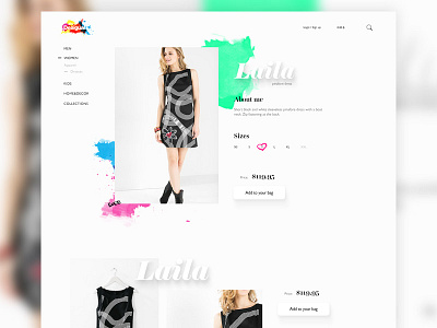
Desigual webshop
Hello, all!
Recently, I came across a fashion brand named Desigual, and I instantly liked their visual communication and overall brand tone.
Noticed that their webshop bit lacked to convey that positive personality so I gave it a try in redesigning it. I'm not familiar with a strategic importance of social media buttons in their original webshop so I took a bit liberty by totally eliminating them. Anyway, the goal here is to make something that will stand out and be more in line with Desigual brand personality.
Tell me what you're thinking :)
P.S. Real pixels in attachment :)
More by Mario Šimić View profile
Like

