Jack & Jones Concept Design
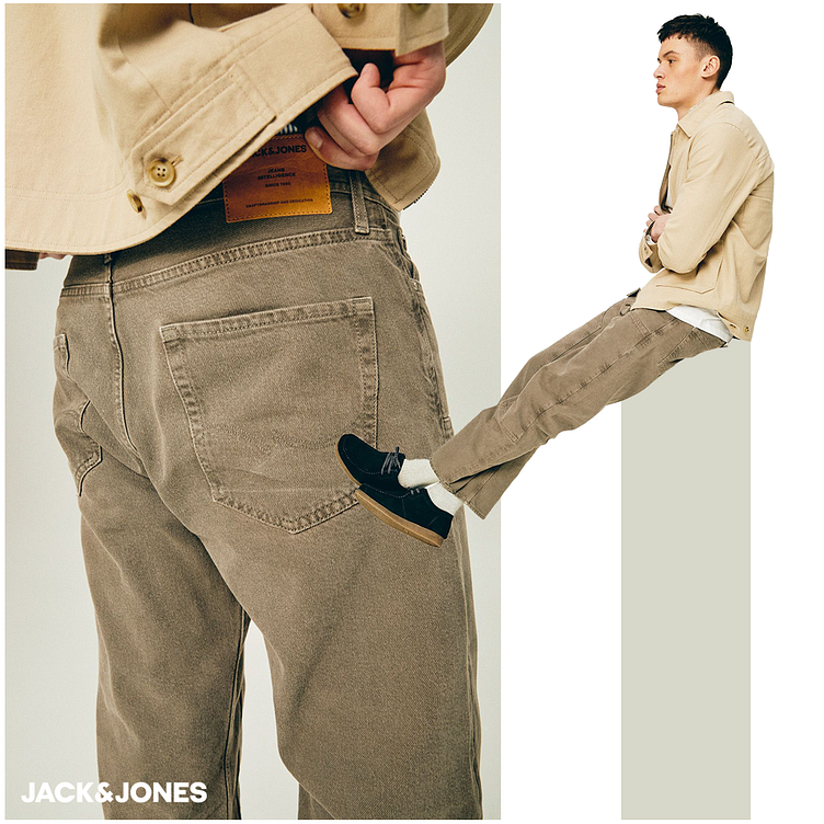
This Jack & Jones banner showcases a stylish, laid-back look with a focus on earthy tones and casual comfort. The design features two distinct images of the model:
Left Image:
Close-up of the back of the jeans.
Emphasis on the texture and color of the stonewashed denim.
The leather brand patch on the waistband is prominently displayed, highlighting the Jack & Jones branding.
Visible stitching and classic pocket design contribute to the rugged aesthetic.
Right Image:
Full side view of the model sitting, showcasing the entire outfit.
The model wears a light beige jacket paired with the same stonewashed jeans.
The combination of white socks and black shoes adds a subtle contrast to the overall earthy tones of the outfit.
The minimalist design of the banner uses a clean, white background to draw attention to the clothing, with the Jack & Jones logo in the bottom left corner, ensuring brand visibility without overpowering the visual focus on the apparel.
