Sidebar navigation Web3 Gaming Community
The goal
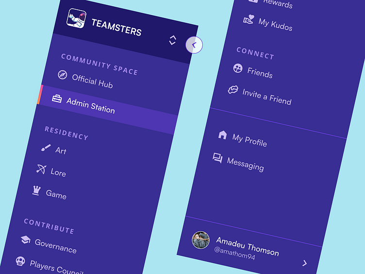
Create a sidebar for one of our client's comunity-based platform, relying on proper navigation and hierarchy best practices to flesh out its structure while applying our proposed UI and palette.
The challenge
This product, as often is the case, was similar to any other community platform but unique in our client's mind. What you see here is the shiny, final version - coming up with that page structure however proved to be the trickier part, as in our initial conversations there were a few more pages/features to include. Our job was to rename, regroup and reorganize our client's initial vision into a logically accesible nav bar UX-wise.
The outcome
We ended up with a nav bar both we and our client were happy with, and since it took up a prominent chunk of space on screen it was important that the colours and UI chosen worked. It uses their brand colour, it's lively and playful, clear what page you're on... nice little sidebar for a gaming community!
What do you think? 👀
Work with us!
UserActive is a product design agency for B2B SaaS. We’re on a mission to help SaaS Founders create meaningful products users love.
Book a call 👉🏼 www.useractive.io
