Fitness Booking Transaction

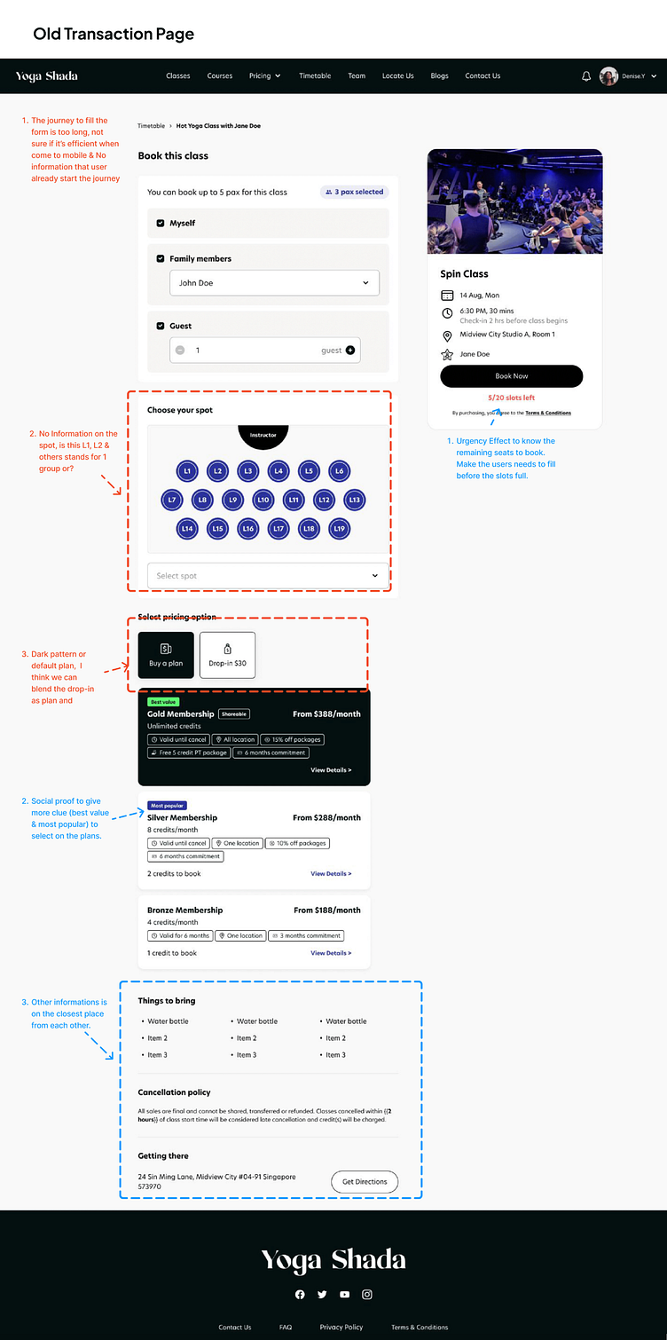
I was tasked to improve the transaction or sales on this page in this design task. As you can see, the first page lacks experience, so I felt that because: The journey to fill out the form is too long the dark pattern or default plan makes the user feel forced to buy the higher plan.
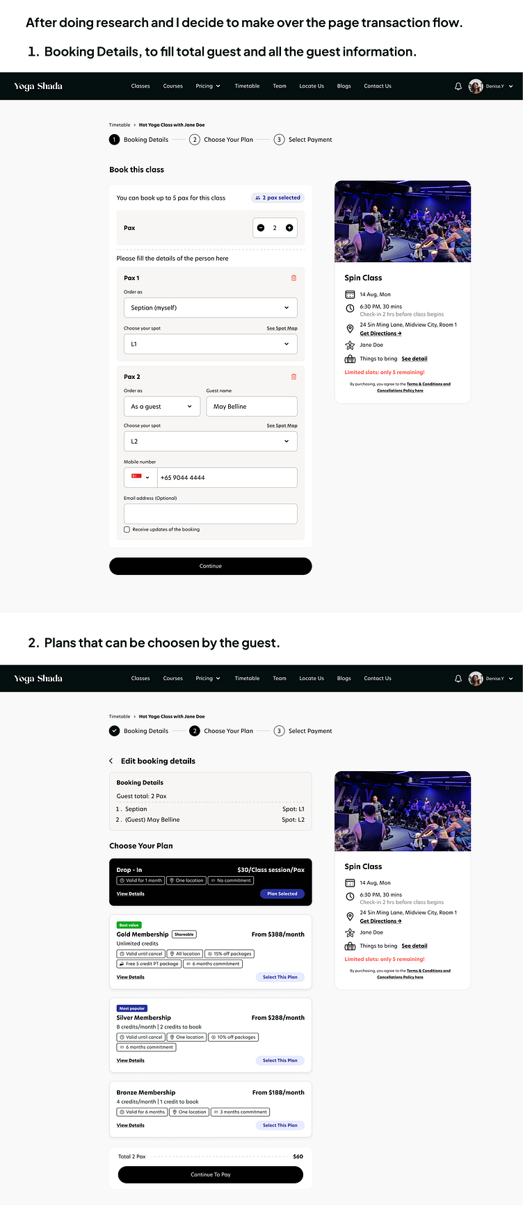
After research some of the ux principle, I decide to change some of the problem that might be blocking the transaction flow, and keep the principle such as the urgency effect on the remaining slots and removing dark patterns and change it into drop in package plan to make the new user easy to change the plan.
If you have any concerns related to my work. Please let me know you can dm me throught chat! Thanks!