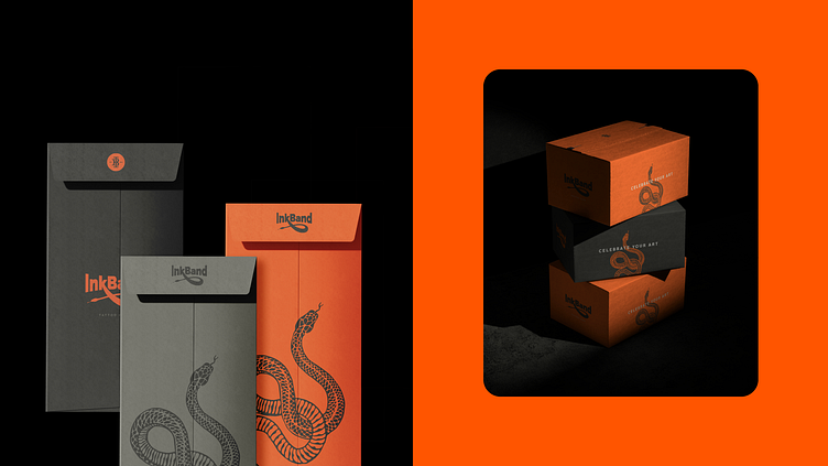
Brand and Packaging Design for Tattoo Skincare Company
Revitalizing brand image to resonate with target audience.
Redefining positioning to reflect innovative spirit and appeal.
Establish fresh identity to command attention and empowerment.
InkBand's rebranding journey included a bold logo with a snake motif symbolizing renewal. The packaging design featured a spiral motif inspired by the snake's form.
InkBand's rebranding initiative resulted in a symbol of strength and empowerment.
See full project: BEHANCE
More by INDUSTRIA Branding Co. View profile
Like
