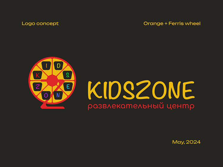
KidsZone Logo
Kidszone is quite popular name and used a lot for logotypes. It wasn't easy to find unique option.
I started from associations tree and find carousel. Kids like carousel, don't they? A sketch to visualize it. Do you notice that it looks like sliced orange? Ok, let's go to Adobe Illustration ...
Swipe carousel to see how the idea was progressing.
First option is more realistic but a little bit dispersed.
Second option - I tried to make it more compact, but too much colors. Do you think?
Finally, we have a graphic element with number of allusions. Orange as symbol of happiness, carousel (ferris wheel) as letter "O" stating on letter "Z" and cabins with colored letters "kids zone". What the allusions do you see? Pizza? Something else? :-). Graphic part is compact and balanced now, on my view.
Interesting, what option do you like?
Font element is added and final design for your review.


