Nylasa - CRM Landing Page
Overview
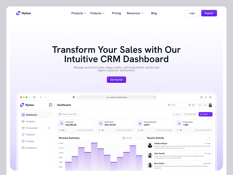
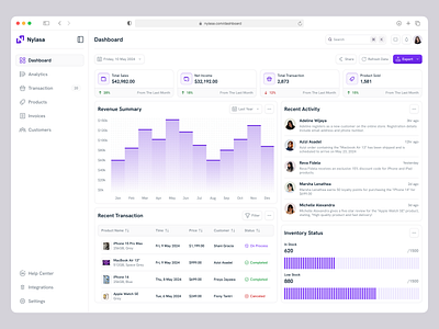
The Nylasa landing page is designed with key sections including Hero, Why Us, Features, and FAQ. The goal is to make a strong first impression, convey the core value of the product, highlight key features, and answer common questions to help visitors understand and become interested in the Nylasa CRM platform.
Challenges
Creating a Strong First Impression: The Hero section needs to capture visitors' attention within the first few seconds to reduce bounce rates.
Convincing Visitors of the Product's Superiority: The Why Us section must effectively convince visitors of Nylasa's key advantages and benefits over competitors.
Effectively Communicating Product Features: The Features section needs to clearly and attractively explain Nylasa's main features without overwhelming visitors with too much information.
Answering Common Questions Clearly: The FAQ section must provide clear and concise answers to common questions visitors may have, helping reduce confusion and hesitation.
How We Solve
Engaging Hero Section: We design the Hero section with compelling visuals, a strong tagline, and a clear call-to-action to immediately grab visitors' attention upon landing on the page.
Convincing Why Us Section: We highlight Nylasa's main advantages, including customer testimonials, case studies, and other social proof to build trust and convince visitors that Nylasa is the best choice.
Informative Features Section: We use a combination of text, icons, and videos to explain Nylasa's main features in an easy-to-understand way, balancing sufficient information with an attractive layout.
Comprehensive FAQ Section: We provide an FAQ section with the most commonly asked questions and answers, structured and easily accessible, to help visitors quickly find the information they need.


