TECH OPS ASIA | LOGO DESIGN & BRAND IDENTITY
Tech Ops Asia is a modern technology brand, pioneering in providing optimal technology solutions. With a mission of innovation and connectivity, Tech Ops Asia is always committed to providing customers with outstanding products and services, meeting all technology needs of the digital age.
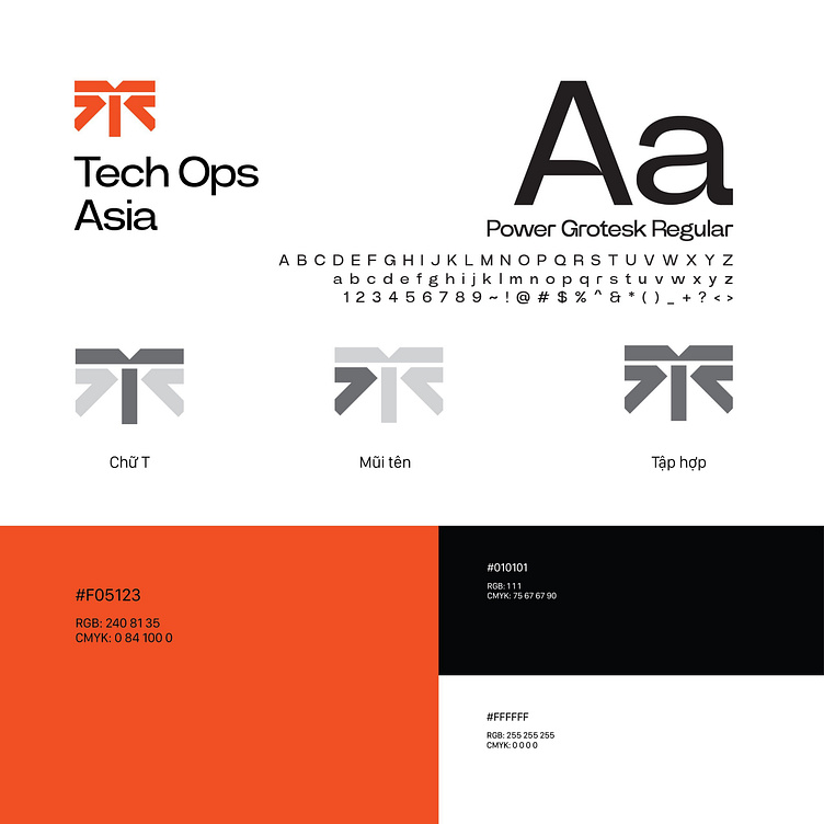
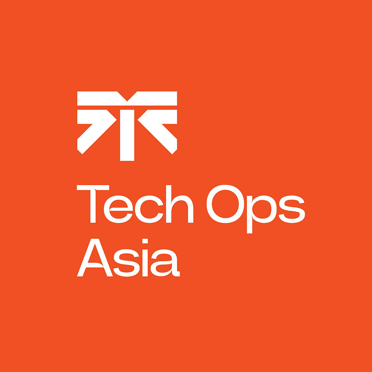
The Tech Ops brand identity uses three main colors orange, black, and white that stand out and are unique and convey many messages. The vibrant and dynamic orange color symbolizes creativity, innovation and enthusiasm. This is the color of pioneering and aspiration to rise, reflecting the spirit of continuous innovation and development of Tech Ops. Black symbolizes professionalism, modernity and prestige, creating a striking contrast with orange. White color creates balance and harmony for the overall identity.
The logo design of Tech Ops Asia is accented by the stylized letter "T" to represent technology (Tech), showing the focus on the main area in which Tech Ops operates. The solid, strong "T" is a symbol of stability and reliability. The arrow in the logo signifies progress, development, and direction to the future. When combining these 2 elements, it creates a unique symbol representing the gathering, emphasizing Tech Ops Asia's ability to connect technologies, solutions and people together to create outstanding values for customers.
Designed by Bee Art
-
Client Inspire Desk
Logo and Branding Project. Logo is design for Technology Company in Vietnam.
Copyright© Bee Art. All Right Reserved
Contact us:
• Hotline/ Zalo: (+84) 77 34567 18
• Email: info@beeart.vn
• Website: www.beeart.vn
• Facebook: https://www.facebook.com/BeeArt.vn