IST - Website & Web shop redesign
Project goal
Redesign the responsive website and webshop.
Understand the needs of the different types of customers and stakeholders.
Realise a web portal that fulfils the needs of the customers and stakeholders.
Execute best-practice user experience and responsive design.
Improve the information and communication via the website.
My role and KPIs
Responsibilities and tasks:
Design a user-friendly web solution.
Focus group and workshop facilitation, incl. workshop planning and material preparation.
Create a questionnaire and analyse the answers.
UX/UI design and prototype creation.
Facilitate the concept validation and refine the concept
Detailed UI design and design assets.
Create epics and user stories.
KPIs:
Execute a client project as a lead designer and provide detailed solution design.
Project Timeline
Insight - Problem space
Methods:
Interview
Focus groups
Questionnaire
Outcomes:
Product vision
Personas
Features (needs) for each persona
Business value and technical certainty of the features
Conceptualising - Solution space
Methods:
Workshop
Participatory design
Concept validation by interviews
Concept validation by prototype testing
Outcomes:
Visualised Customer Journeys
Sketches for the solution
Prioritised features (basis for the backlog)
Wireframes and prototype
Detailed design and implementation
Note: Before I changed an employer at the end of October, I provided all the designs as detailed as possible. At that moment, the content was not yet finalized, and pictures were not selected.
Outcomes
Detailed design
Design guidelines and assets, incl. font and text style usage, colour usage, main components
Epics and user stories related to designs
Clickable prototype
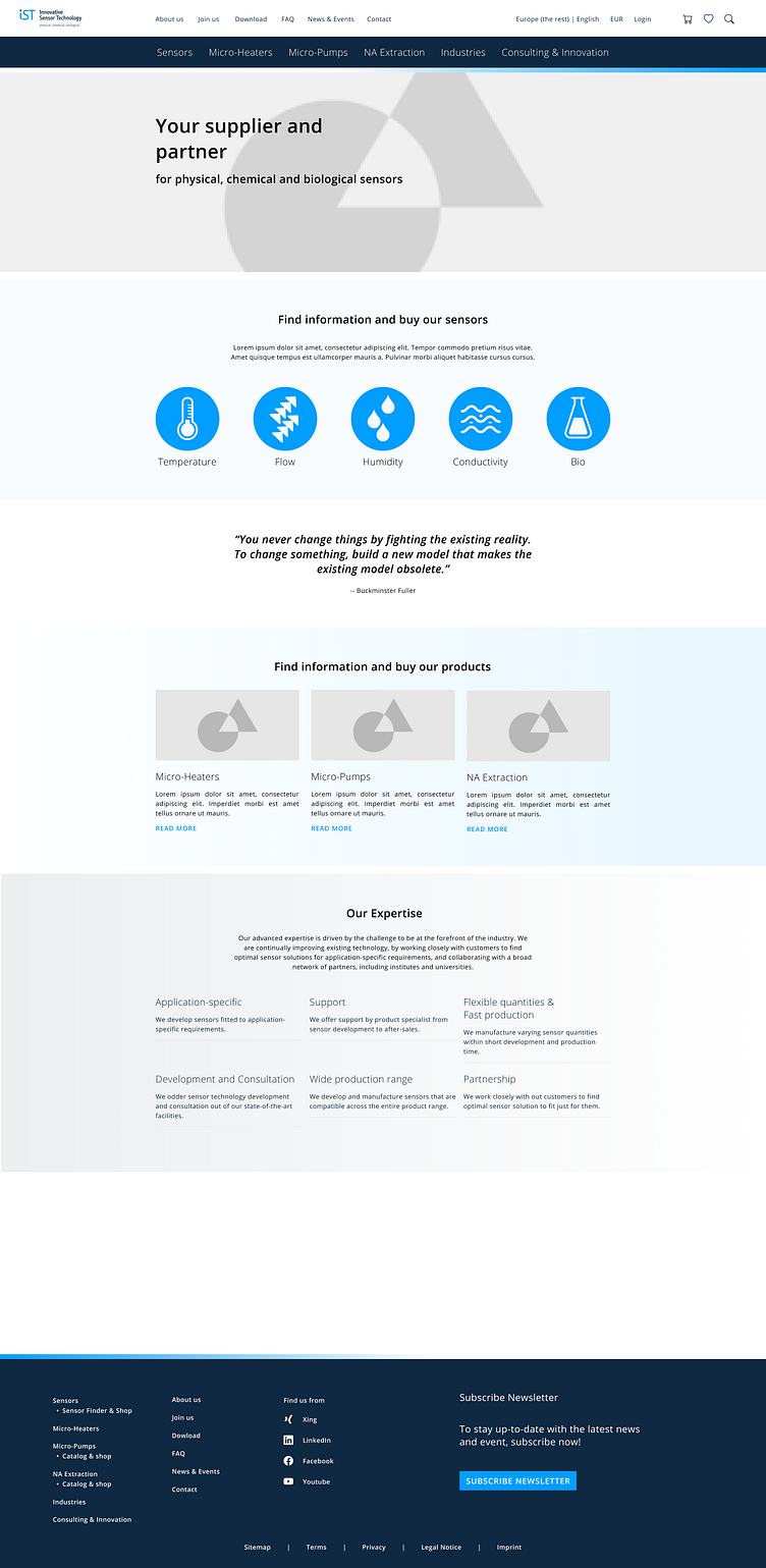
Below, you can find before and after pictures.
Navigation
The old navigation did not have a clear hierarchy. In the new navigation, the entries were grouped:
the main navigation contained the services the company provides,
the secondary navigation above the main navigation was focused on the company information and
the top right corner was dedicated to the user to access their own account and their shopping basket
About us -page
New content structure to make information more accessible.
Use different UI components to group information and reduce the monotony.
Hiring and contact information are kept in their own entry.
Products and services -pages
Redefine information hierarchy
Reduced content so that important information can be found.
Combine the product catalogue, the product descriptions, and the webshop to make the navigation more intuitive and provide the information only in one place.
Use different UI components to group information and reduce the monotony.
Always indicate in the navigation and in the breadcrumb where the user is located in the system.
Product description and product details:
Users do not buy sensors based on how they look but on their features. Sensors can also be so small that a user cannot compare their appearances. For this reason, unlike, e.g., clothing web shops, users are shown detailed information instead of a picture of the sensor.
New feature: Product finder (product search):
A new feature
Make it more intuitive for the users to find the sensors they are looking for.
The search is done in 3 steps to reduce the amount of results and enable users to define technical requirements based on their needs.
The user is also able to do a traditional search to find a product, e.g. by a name
New feature: Product finder (product search):
A new feature
Make it more intuitive for the users to find the sensors they are looking for.
The search is done in 3 steps to reduce the amount of results and enable users to define technical requirements based on their needs.
The user can also do a traditional search to find a product, e.g. by a name.
New feature: My account
To enable more efficient shopping, payment, and invoicing.
To save favourites
Launched website
Here, you can find the implemented version of the website:
Note: I changed jobs soon after the implementation started.


