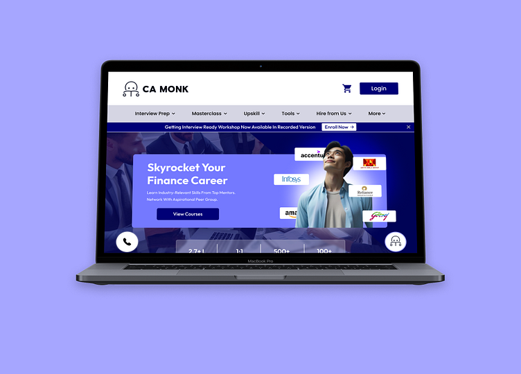
CA Monk Website Redesign
Here's the current Homepage of their website.
And Here's the full view of my redesign.
A Redesign of camonk.com 's homepage I created to practice website redesigning.
By looking at their current Homepage I noticed their main moto was to sell more courses to students, So I moved main elements like their Main courses and free courses sections up so it would be first thing to notice after reading their main goals which can increase the chance of buying those courses.
Moved down the explore courses section below them to keep exploring at last after looking at main and free courses.
Then redesigned Student testimonials, Mentors and Blogs section.
And Finally the Footer.
Homepage Walkthrough.
More by Tejas Jadhav View profile
Like


