Rimora Brand Guideline
Overview
Rimora TechWork is a startup focused on developing cutting-edge software solutions for businesses in various industries. Founded in 2020, we pride ourselves on our innovative approach and customer-centric products.
Logo Philosophy
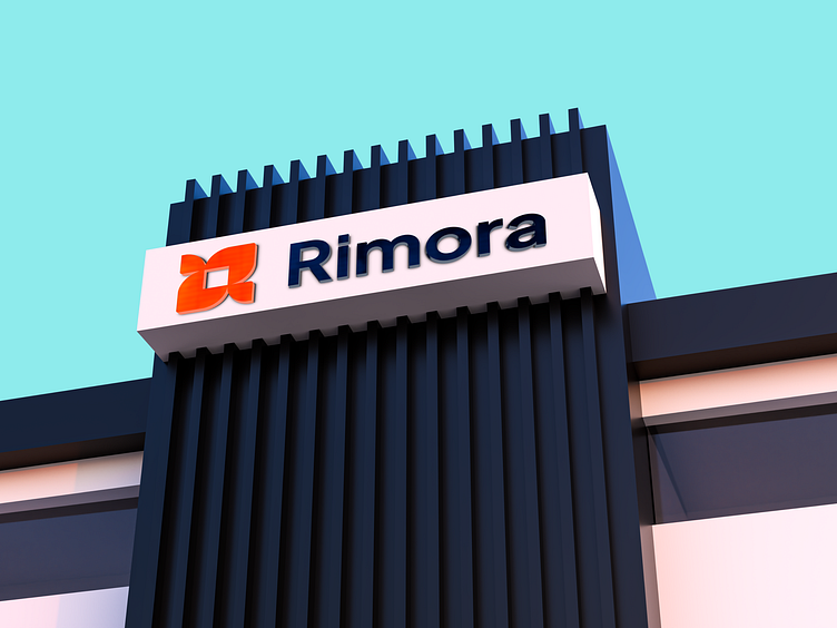
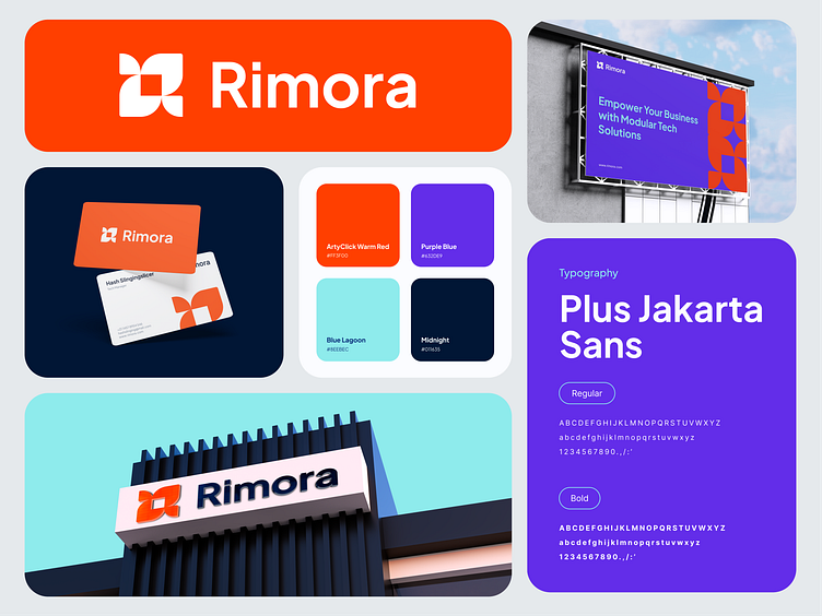
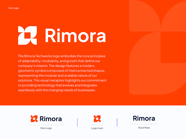
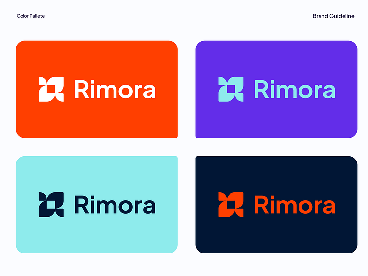
The Rimora Techworks logo embodies the core principles of adaptability, modularity, and growth that define our company's mission. The design features a modern, geometric symbol composed of interconnected shapes, representing the modular and scalable nature of our solutions. This visual metaphor highlights our commitment to providing technology that evolves and integrates seamlessly with the changing needs of businesses.
Design Specifications
Style Preferences: Modern, sleek, and professional with a hint of creativity
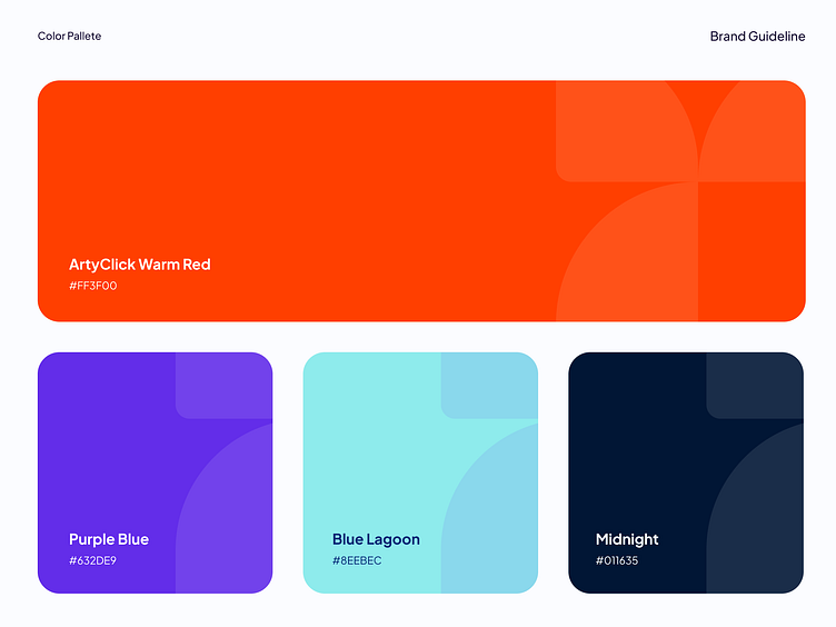
Color Preferences: purple (to signify creativity and exclusivity), with an optional accent color (e.g., orange for creativity)
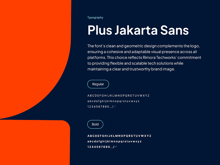
Font Preferences: Clean, sans-serif fonts that convey modernity and clarity

Brand Implementation