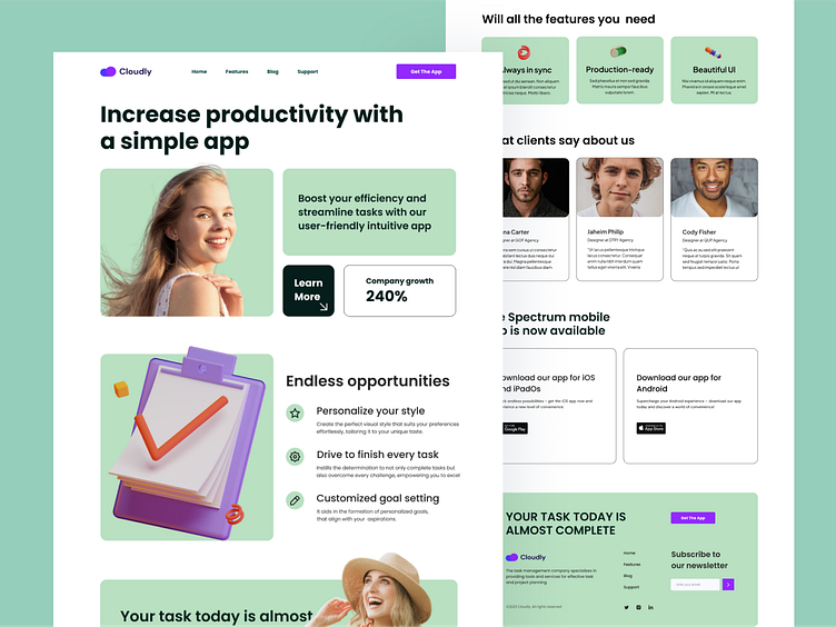
Task Manager Platform
Hello, dribbblers!
In this shot of my design, the Landing Page for Task Management on Dribbble showcases an impressive layout that guides the user through all decision-making stages. The first screen immediately captures attention, drawing them to the main message. With its attractive visual design and clear communication, it captivates and engages. The second screen provides a more detailed portrayal of the app's functionality, its advantages, and capabilities. Enhancements in this design underscore the product's importance and prompt the user to take action, providing a direct path to download the app through vibrant CTA buttons. All these screens help the potential client understand the product's benefits and feel confident in their decision.
Press L if you like it ❤️
Thank you.
I am open to your suggestions 🤠 please send your request to my email at ✉️kateryna.burych@gmail.com, or contact me via ☑️ Linkedin
