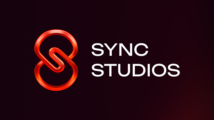
Sync Studios Logo Design
Overview
Sync Studios, a game studio at the forefront of entertainment and web3 tech, needed a logo that would reflect their dynamic and interconnected game development approach.
With the upcoming launch of the much-anticipated Cool Cats game, a collaboration with the famous Cool Cats brand, the logo had to embody both their state-of-the-art technology and playful, engaging essence.
Concept
The Sync Studios logo showcases an interlinked, fluid design symbolizing the seamless blend of technology and creativity.
The vibrant red color conveys energy, passion, and excitement, while the interconnected elements represent the unbroken connection within the web3 ecosystem and the immersive gaming experiences Sync Studios delivers.
Outcome
Interconnectedness: The intertwined elements of the logo highlight Sync Studios' commitment to creating unified and integrated gaming experiences, leveraging the power of web3 technology.
Energy & Passion: The bold red color choice reflects the studio's enthusiasm and the exciting nature of their games.
Fluidity & Movement: The continuous, looping design signifies movement and flow, representing the dynamic and ever-changing world of web3 gaming.
The Letter S: Central to the logo is the S shape, symbolizing Sync Studios' name and embodying the brand identity.
The logo can adopt a vertical layout based on the area where it needs to be placed.
And it also comes with solid color usage options.
What do you think?
- Follow me for more updates and detailed shots from this project coming soon!
- If you enjoyed this, explore my profile for more of my work and let’s connect!


