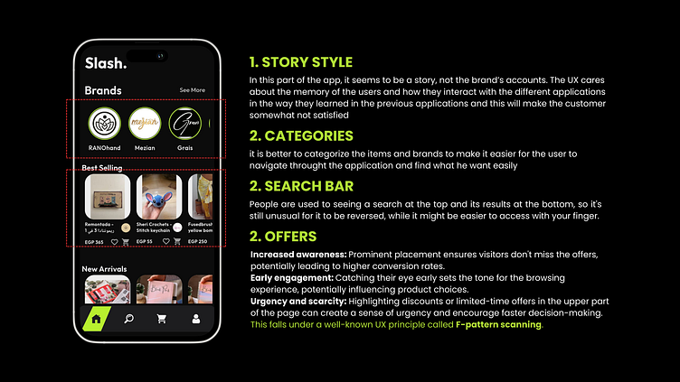
Slash Home Page redesign
1. STORY STYLE
In this part of the app, it seems to be a story, not the brand’s accounts. The UX cares about the memory of the users and how they interact with the different applications in the way they learned in the previous applications and this will make the customer somewhat not satisfied
2. categories
it is better to categorize the items and brands to make it easier for the user to navigate throught the application and find what he want easily
2. SEARCH BAR
People are used to seeing a search at the top and its results at the bottom, so it's still unusual for it to be reversed, while it might be easier to access with your finger.
2. Offers
Increased awareness: Prominent placement ensures visitors don't miss the offers, potentially leading to higher conversion rates. Early engagement: Catching their eye early sets the tone for the browsing experience, potentially influencing product choices. Urgency and scarcity: Highlighting discounts or limited-time offers in the upper part of the page can create a sense of urgency and encourage faster decision-making. This falls under a well-known UX principle called F-pattern scanning.

