ZARSHID | Logo & Brand Identity
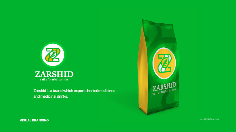


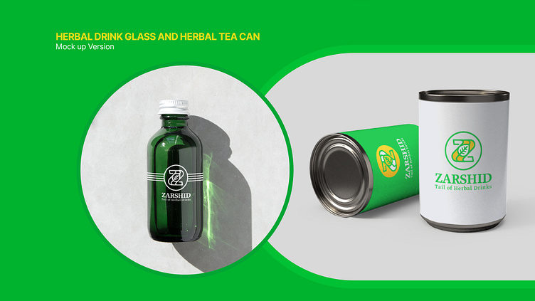

ZARSHID Company is an exporter of various medicinal plants to different countries. Medicinal plants, as part of traditional medicine, utilize seeds, fruits, roots, leaves, bark, or flowers of plants for treatment.
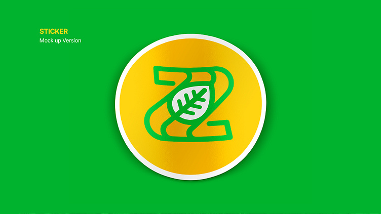
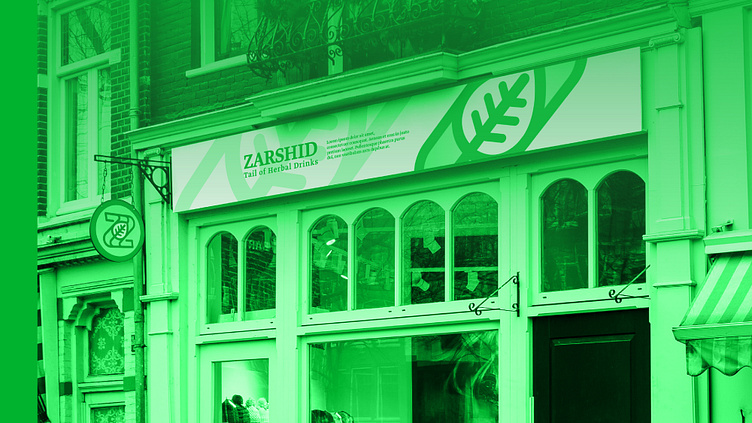
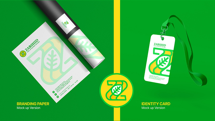
The logo for the ZARSHID brand is an attempt to design a unique identity that is in harmony with the company's activities using two elements, namely a leaf and the first letter of the brand name (Z). The leaf symbolizes a natural element and a symbol of life, growth, and freshness. The choice of the leaf symbol is well-aligned with the company's activities in exporting herbal medicines.
The selection of yellow and green colors against a white background and the contrast between them has created a beautiful combination. The yellow symbolizes vibrancy, energy, and happy feelings; And evokes positive emotions. This color can attract attention and make the logo prominent. On the other hand, the green color, as a symbol of nature, health, confidence, and tranquility, resonates with the audience. The combination of these two colors in the logo creates balance and harmony.
Exporter of herbal medicines
• Logo Tasarım ve Görsel Kimlik
• Logo Design & Brand Identity