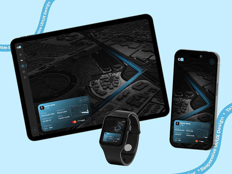
Responsive UI/UX Design for Ride Sharing App
Introducing our latest project, a fully responsive UI/UX design tailored for a ride-sharing app, showcased across multiple devices: tablet, mobile, and smartwatch. This design ensures seamless user experience and functionality across all devices.
Tablet Layout: Users can browse rides, view driver details, and book trips effortlessly with a spacious and clean interface.
Mobile Version: Key functionalities are condensed for a compact, one-handed experience, perfect for on-the-go access.
Smartwatch Integration: Essential ride information and controls are curated for easy management and updates with a quick glance.
Throughout the design, we've emphasized clear typography, prominent call-to-actions, and a cohesive visual language that reinforces the brand identity. The seamless transition between devices empowers users to stay connected and in control of their ride-sharing journey, no matter the screen size.
Ready to build your ride-sharing app? Whether you need a design created from scratch or a clone of an existing model, let's connect and discuss how our responsive UI/UX design can enhance your user experience.
Press "❤️️" to show your love.
Follow us to see more insights on:
aPurple | Facebook | Linkedin | Instagram | App Design | YouTube
