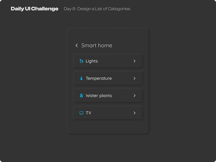
Day 8 of improving my UI skills · #8 Design a List of Categories
Process
For today I needed to design a list of categories. Well first I choose a topic, wrote the copy, selected the icons and made the structure. Then I wanted to try out the neumorphism style, which I did very well but I was using colors like full black and white for the shadows and that seemed off to me, so I search settings for this style and found an incredible plugin called neumorphism and I study how they made such nice shadows, the key is using around 13 points up or down (select the color and press the arrows), playing with opacity and using like 6 shadows to make it seamless. And that's it I guess.
What I would change
I did not like a lot this design but I'm sure I'm gonna improve with time and good practice. For me the category titles, the size of the icons and the typography do not seem to match.
This is a public challenge made by hype4 academy (or SquarePlanet I don't know).
