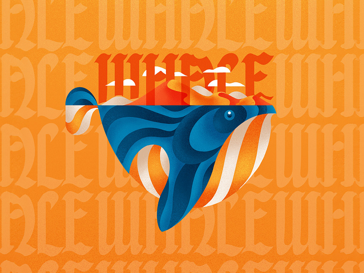
Whale + Blackletter Type
⚡️What do you think!? Is it better with or without type? See below to compare.
For the reel on this one, see my INSTAGRAM.
I’m honestly torn. I like the simplicity of it without, but like the letterforms to add some visual interest and some texture to the background.
I think there is some awkward negative space between the L & E, where I could’ve done some sort of ligature, but I didn’t 😂 So how did I add type?
I wanted the whale type to interact with my illustration, so I used masks to layer it in between the clouds and the dunes. Probably some contrast issues, but I’m happy with it.
Let me know if you have any questions. Never hesitate to reach out. Love talking design, type, and illustration! So is it better with or without the type? Let me know!
Oh, and create more than you consume today!!

