30 Days of UI - 01/30
01 / 30: My 30-Day UI Challenge
(I took on a new challenge and the first result was awesome.)
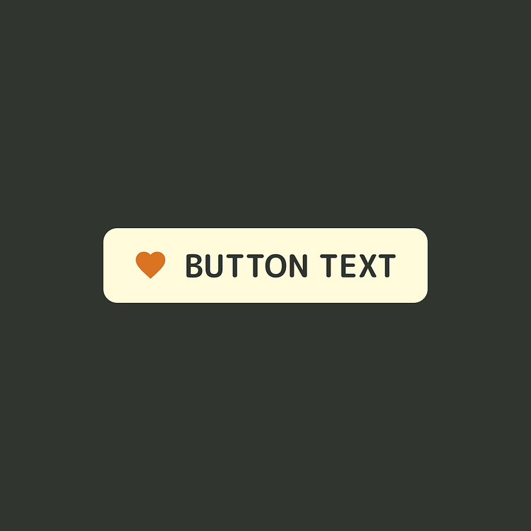
My first task was to create a button component.
"But Gui, that's so simple!"
Anyone can do complex, but simple requires knowledge of fundamentals.
The twist? I used a randomly generated color palette.
I was hoping for a cool, techy palette. Instead, I got autumn fall colors, which are not my favorite. But I embraced the challenge.
The process:
Created Roughs I made a panel with all button types and variations without worrying about the final product.
Vibe Panel I made a "vibe panel" with an image and a name for a fictional product. This helped me work with the palette in context.
Design and Refine Using the palette, I created the button component and its states/variables. After some trial and error, I arrived at a satisfying solution.
In the end, I was proud of what I achieved.
P.S. Ever had a design challenge where the colors just didn’t vibe with you? How did you handle it?


