Warframe - Simplified Mobile App Redesign

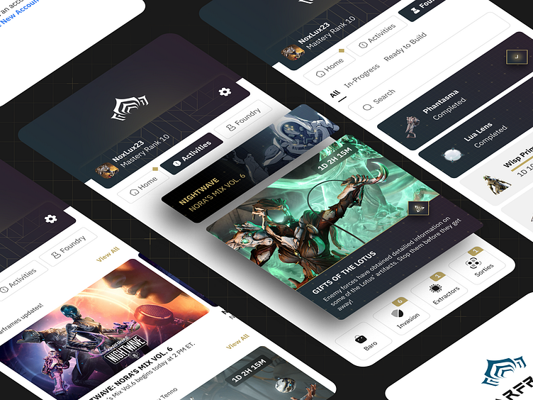
Here's my take on the Warframe Mobile App Redesign.
Been coming back to playing Warframe recently and I recall that they have a companion app for the game.
After a month of use, I identified a couple of opportunities that can be implemented to improve the user experience for Tenno on the go.
My redesign focuses on streamlining the app's functionality. I removed redundant features that mirrored the in-game features and prioritized functionalities that are most valuable for mobile management (such as time limited events, Battle Pass, and Foundry progression).
This creates a cleaner, more intuitive interface that empowers players to manage their Warframe experience from anywhere.
Design Process
1. Exploration
Refers to a phase in the design process where you actively gather information, brainstorm ideas, and experiment with various solutions.
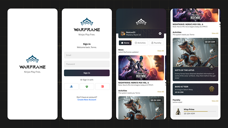
Sign-in Screen
Pain Analysis
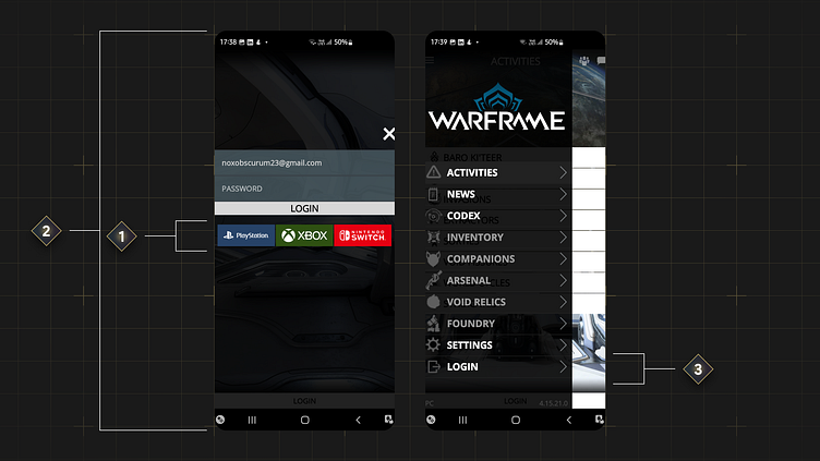
Guest Access: The app allows users to explore without signing in, potentially increasing user engagement. However, core features like Foundry and Battle Pass progress are inaccessible without an account, rendering the app functionally limited for unregistered users.
[1] Account Creation: The app currently lacks account creation functionality. While most users create accounts on the Warframe official website, offering in-app creation can enhance user experience.
[2] Layout: Can be improve. Gaps can be filled in.
[3] Sign-In Flow: The sign-in process requires navigating hidden menus to find the "LOGIN" option. A more intuitive and streamlined sign-in flow would be desirable.
The Cure
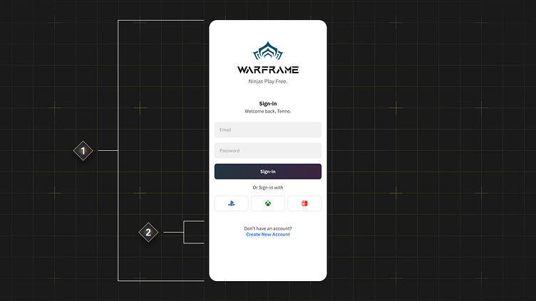
Sign-In Flow: Signing-in is now a mandatory steps users need to take.
[1] Layout: Improved layout, maximizing space.
[2] Account Creation: Now users can create a new account right away from the sign-in screen.
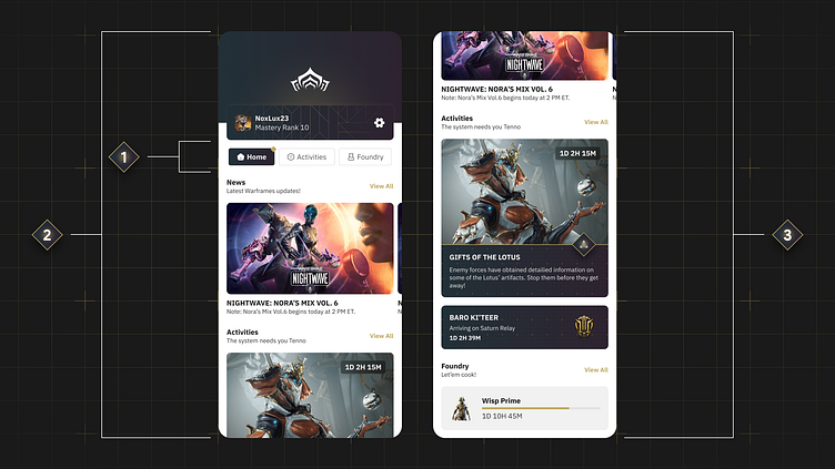
Home Screen
Pain Analysis
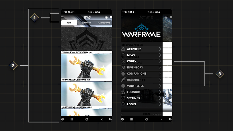
[1] Feature Consolidation: All features are condensed here.
[2] Inefficient Home Screen Layout: Usually on a Home Screen, many relevant information are summarized into a one concise layout. Displaying only the News section might limit exposure to other great Warframe mobile app features.
[3] User Behavior: Users frequently access these additional features while online in-game, not in the mobile app (based on personal experience). I decided to remove them completely.
The Cure
[1] Clear Navigation: Opted for tab-based navigation instead of a hamburger menu, promoting easier access to key functionalities.
[2] At-a-Glance Awareness: Crucial information is readily available right away on the screen, eliminating the need to navigate through a hidden menu.
[3] Prioritized User Needs: By focusing on the three most frequently checked features, which are News, Time-Limited Activities, and Foundry item progression, the redesign prioritizes user needs and streamlines the user experience.
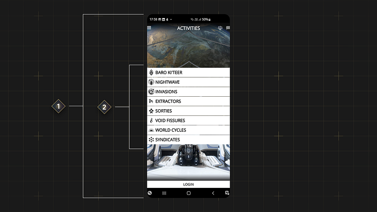
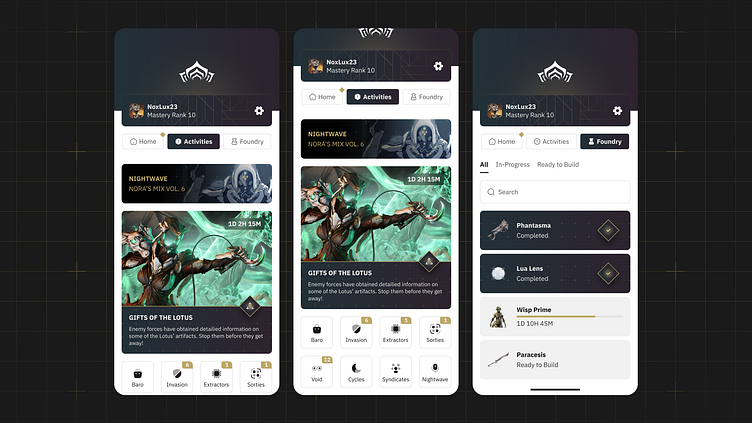
Activities Screen
Pain Analysis
[1] Layout: Can be improve more. Gaps can be filled in.
[2] User Awareness: there is a lack of visual cues to inform users of upcoming and ongoing activities within the Activities category.
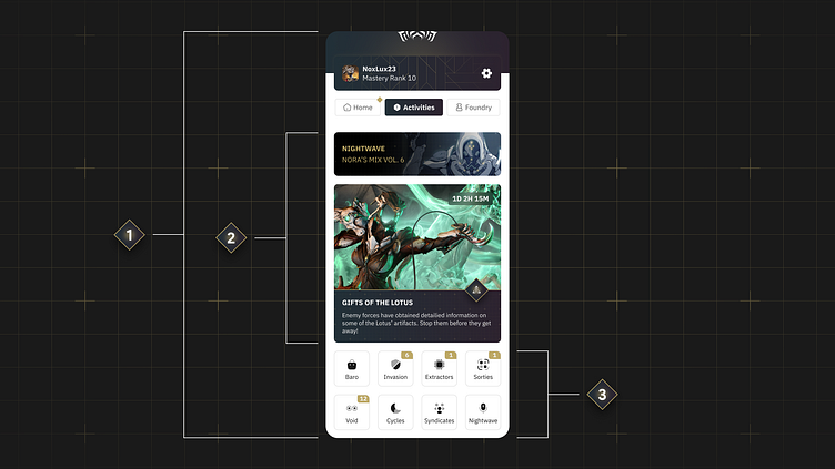
The Cure
[1] Layout: Improved layout, maximizing space.
[2] Card Section: A dedicated section keeps users informed about upcoming and ongoing Activities.
[3] Category-Specific Cues: Implemented visual cues tailored to specific Activities categories, ensuring users stay on top of what matters most to them.
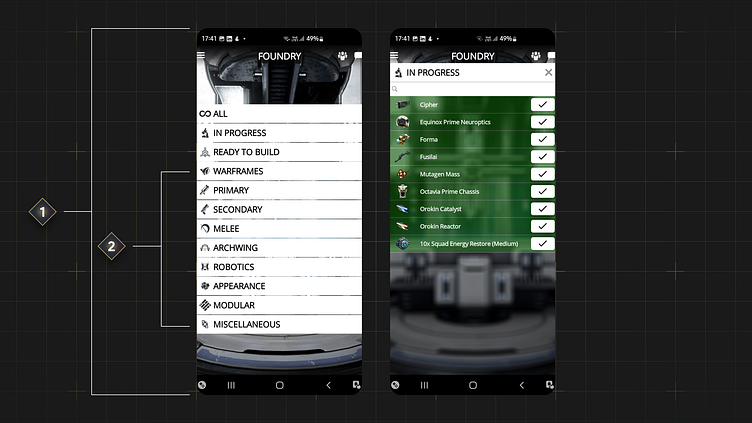
Foundry Screen
Pain Analysis
[1] Layout: Can be improve. Gaps can be filled in.
[2] User Behavior: Users frequently access these additional features while online in-game, not in the mobile app (based on personal experience). I decided to remove them completely.
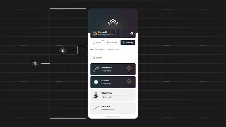
The Cure
[1] Layout: Improved layout, maximizing space.
[2] Prioritized User Needs: By focusing on the three most frequently checked Foundry features the redesign prioritizes user needs and streamlines the user experience.
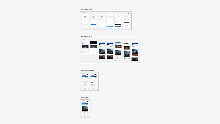
2. Iteration
Refers to a cyclical process of continuously refining a design based on user feedback and testing.
Create > Test > Analyze > Refine > Repeat.
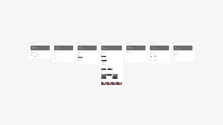
3. Finalization
Implementing Figma Component, applying Auto-Layout, and fine-tuning to make sure the overall design is consistent.
Tools and Resources
Design Tools
Figma Plugins
Figma Resources
Others
Font
Aquire
IBM Plex Sans