Gaia Fast food company - Visual Identity
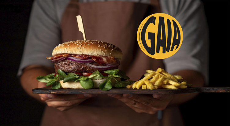
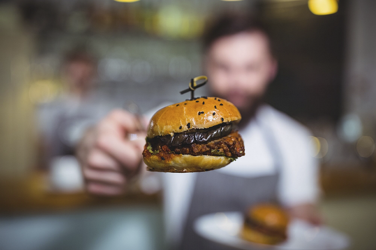
GAIA is a fast food company whose mission is to meet customer needs with quality, transparency and fair prices. It offers a varied menu such as burgers, milkshakes, portions, drinks.
The symbol was designed exclusively for the brand, making it unique and totally authentic. As a result of this process, a logo was developed in which the word GAIA was inside the circle, bringing retro and with the aim of making the logo more fun and out of the norm; transmitting to the public the essence of a happy, laid-back, innovative brand that is different from the market standard.
The woodcut style was used as inspiration for both the letters and the illustration. For GAIA's Visual Identity, the main typography chosen to support the brand's communication and tone of voice was Jadefedga Regular and for the supporting typography, Source Vans Variable.


The colors chosen were orange, which conveys joy, vitality, energy and creativity. It is a stimulating color, and induces hunger, it is a common color in the preparation of tasty foods, therefore, these tones together convey a feeling of ready and warm food, further enhancing the desire to eat. It promotes vibration, in this case the dynamism of the brand, conveying speed of service, yellow representing reasoning and is a stimulating color, enhancing the brand's attributes of creativity and optimism, stimulating hunger and attracting consumers' attention. It is also usually used to capture attention, which is always good for attracting passing customers, black which highlights the nobility of the brand and conveys elegance, emotional memory, luxury and authority and white which symbolizes peace, purity and cleanliness. Timeless. It brings contrast with all colors and enhances the legibility of the brand.