SipSmart
A MODERN MOBILE APP FOR WATER CONSUMPTION MANAGEMENT
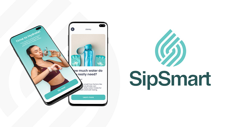
SipSmart is a cutting-edge mobile application designed to help users manage their water consumption, understand the significance of hydration, and contribute to water conservation efforts. The app offers various features, including consumption monitoring, personalized hydration goals, educational content, and progress tracking through graphs and statistics.
OBJECTIVES
The primary objective was to create a logo that embodies the essence of water and hydration while ensuring that the design remains clean, timeless, and modern. It was essential to incorporate elements that reflect the app's functionality and name, thereby making the logo not only visually appealing but also meaningful and memorable. The design needed to balance simplicity and sophistication, catering to a wide audience and maintaining relevance across various media platforms.

THE SOLUTION
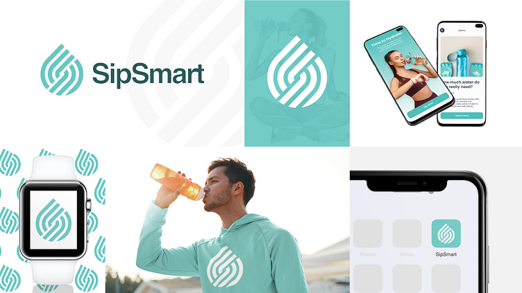
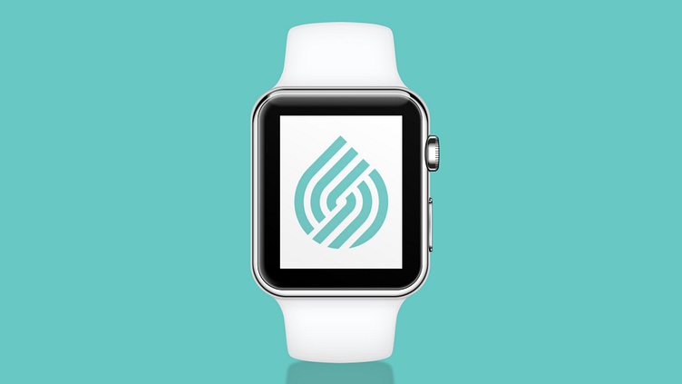
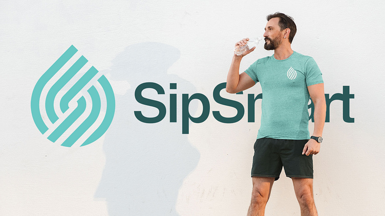
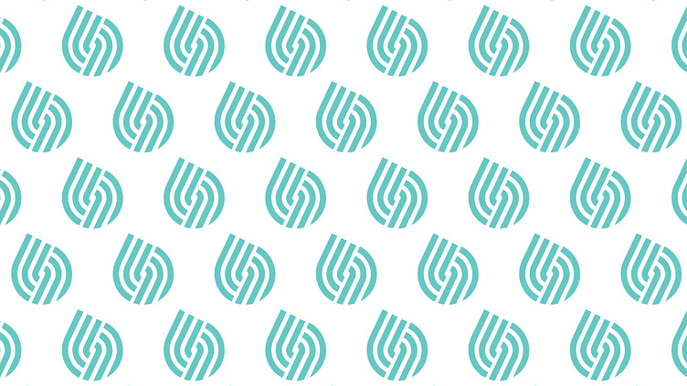
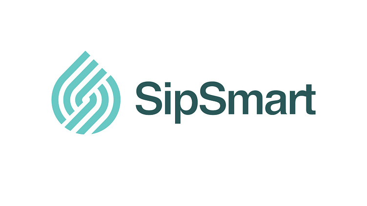
To capture the essence of SipSmart, I designed a stylized drop of water. This minimalist and modern icon serves as a visual representation of the app's primary focus on water and hydration. The clean lines and simple design ensure the logo remains timeless and versatile across various media.
To further reinforce the app's identity, I integrated an abstract letter 'S' into the logo design. This element not only reflects the initials of the app name, SipSmart, but also adds a unique and recognizable aspect to the logo. The abstract 'S' is subtly woven into the water drop icon, creating a cohesive and harmonious design.
The chosen color palette includes shades of blue and aqua, symbolizing water and evoking feelings of freshness, purity, and tranquility. These colors also enhance the app's visual appeal and align with the themes of hydration and conservation.
For the typography, I selected a clean, sans-serif font that complements the modernist aesthetic of the logo. The font's simplicity and readability ensure that the app name stands out without overshadowing the icon.
The logo is designed to be versatile and effective across various applications, including the app icon, promotional materials, and social media. The modern and clean design ensures that it remains relevant and appealing to the target audience, enhancing the overall brand identity of SipSmart.

CONCLUSION
The logo and brand identity for SipSmart effectively communicate the app's core values of health, hydration, and conservation. By combining a stylized water drop with an abstract 'S,' the design achieves a balance of simplicity, modernity, and timelessness. This cohesive branding approach ensures that SipSmart stands out in the market and resonates with its target audiences.
