Tixbase - Logo Design
Logo Redesign for Tixbase
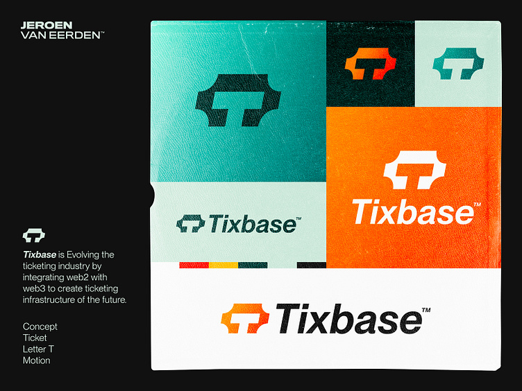
Evolving the ticketing industry by integrating web2 with web3 to create a ticketing infrastructure of the future.
First concept exploration for a smart ticket service called Tixbase. I tried to find a visual shape of an abstract ticket, where the letter T will be hidden and made in a slight 'italic'/tilted shape to visualize the motion/speed of the ticket transfers.
Open for support and feedback.
Need a Logo or Visual identity? 🚀
Feel free to reach out via Dribbble DM or E-mail:
👉 info@jeroenvaneerden.nl - jeroen.design
💼 Connect with me on LinkedIn / Read my Client Recommendations
🎬 Check my YouTube for Logo Tutorials / Learn Logo Design
🔗 Follow me on Instagram / See BTS and New Content
💬 Tweet with me
