SWEAT Logo Design
SWEAT Wordmark
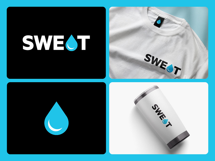
Was driven to create a wordmark that matches the personality of the sports brand resulting in an imagined “SWEAT” logo replacing the letter “A” with a water drop shape. A minimalist logo with an interpretation that stands out in the impression of its appearance.
What do you guys think?
Do you need a Logo design or a Visual identity? 😀
Feel free to reach out via Dribbble DM or E-mail: sandihidayat0204@gmail.com
Instagram | Bēhance | Pinterest | LinkedIn | LogoGround
