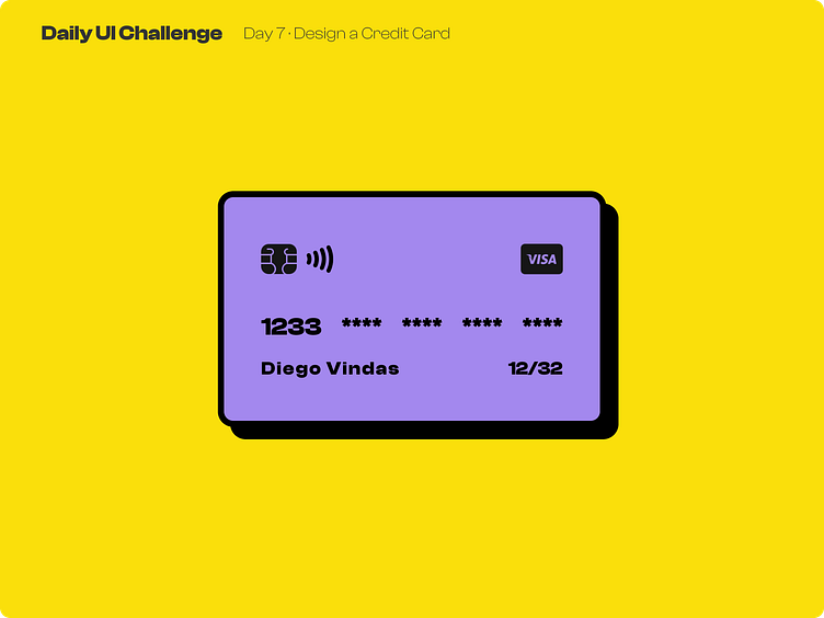
Day 7 of improving my UI skills · #7 Design a Credit Card
Process
Today I had to design a Credit Card. I started by writing the content, searching a font and looking for the icons. Well I wanted to try the Neobrutalism style and today I gave it a shot. For this I knew the essential things for the UI were the drop shadow, the big border and using #000000 (besides the saturated colors ofc). So I began to build the structure and using random colors. When I had everything set I looked for the style in google and found a guide for this style, this was so helpful for the colors and the shapes for the thumbnail.
What I would change
I don't know haha, this style was very fun to play with, so I guess I want to explore more styles and also using this style in a website would be very interesting to see.
This is a public challenge made by hype4 academy (or SquarePlanet I don't know).
Icons by Icons8 and Iconify
