E-commerce Dashboard Redesign
Huephoria - E-commerce Dashboard Redesign
Hi Dribbble!
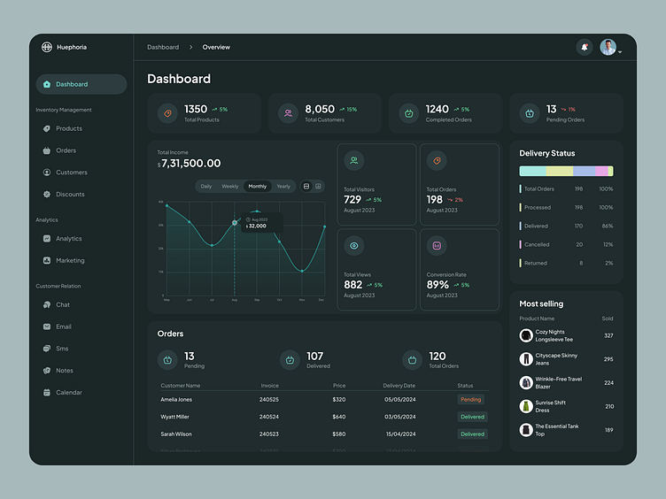
Today I'm excited to share a redesign of the e-commerce platform dashboard for Huephoria, a fashion boutique focused on empowering women through unique styles.
What's New?
This redesign prioritizes actionable insights and simplifies navigation. Here's a breakdown:
At-a-glance Overview: Key metrics like sales, orders, and website traffic are displayed prominently with clear visuals.
Enhanced Data Visualization: Interactive charts and graphs provide deeper insights into performance trends.
Streamlined Navigation: A clean sidebar with intuitive icons makes accessing different sections of the dashboard effortless.
Actionable Insights: Data is presented in a way that allows users to quickly identify areas for improvement and make data-driven decisions.
Modern & Sleek Design: The aesthetics reflect Maysarah's brand identity, with a focus on clean lines, soft colors, and easy readability.
Do you have a fantastic project? Let's talk about it! Please contact me at 📧 alihamxa@hotmail.com
