Mehrsa Publications
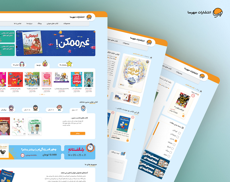
در دنیای امروز، والدین، بهویژه مادران، به دنبال دسترسی آسان به کتابهای باکیفیت برای کودکان خود هستند. تیم ما در حال ساخت یک وبسایت ساده و کاربرپسند است تا خرید این کتابها را راحت کند. این سایت با ناوبری ساده، دستهبندیهای واضح و فرآیند پرداخت سریع، تجربهای آسان را فراهم میکند. هدف ما ایجاد یک منبع ارزشمند برای والدین است که نیازهای آنها را برآورده کرده و به رشد کودکان کمک کند.
In today’s busy world, parents, especially mothers, need easy access to quality children’s books to support their kids’ learning and development. Our team is creating a user-friendly website to make finding and buying these books simple and stress-free. The site will feature clear navigation, straightforward categories, and a quick checkout process, ensuring a smooth shopping experience. We’ll use plain language, helpful descriptions, and visual aids to make the site easy to understand for everyone. With strong customer support and honest reviews, our goal is to provide a valuable resource that meets the needs of parents and helps children thrive.
What was important during the creation of Mehrsa
Easy to Use and Understand
Intuitive Navigation: The website should have a clear and simple navigation structure. Mothers, often juggling multiple tasks, need to find what they are looking for quickly without any confusion.
Clear Categorization: Books should be categorized in a way that is easy to understand, such as by age group, genre, or educational focus. This helps users quickly find suitable books for their children.
Responsive Design: The site should be accessible and easy to use on various devices, including smartphones and tablets, as many users might prefer browsing on these devices.
User-Friendly Interface: Buttons, links, and menus should be clearly labeled and easily accessible. Visual cues like icons and images can help guide users through the site.
Simple Checkout Process: The purchasing process should be straightforward and quick. Simplified forms, multiple payment options, and a clear summary of the order help reduce the time and effort required to complete a purchase.
Understandable for everyone
Clear Language: Use plain and straightforward language that is easy to understand. Avoid technical jargon or complex terms that might confuse users.
Helpful Descriptions: Provide detailed and clear descriptions of each book, including age appropriateness, a brief summary, and key themes. This helps parents make informed decisions.
Visual Aids: Use images and videos to provide additional context and understanding. For example, showing a preview of the book or a video review can be very helpful.
Customer Support: Offer easy access to customer support through chat, email, or phone. A comprehensive FAQ section can also help answer common questions quickly.
Feedback and Reviews: Allow users to read and leave reviews. Honest feedback from other mothers can be incredibly valuable in helping users choose the right books for their children.
By focusing on these aspects, the team can create a website that is not only functional and efficient but also welcoming and accessible to its primary user base: mothers looking for the best books for their children. This approach ensures that the project meets the needs and expectations of its users, leading to greater satisfaction and success.
you can check out live website HERE
Please press the (L) key if you like it❤️
Available for Work Inquiries:
you can also find my other works here

