KOSAR | Logo & Brand Identity
KOSAR is a brand that offers herbal medicine and health services. Herbal medicine, also called botanical medicine or phytomedicine, refers to using a plant's seeds, berries, roots, leaves, bark, or flowers for medicinal purposes.
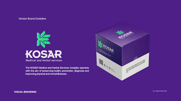
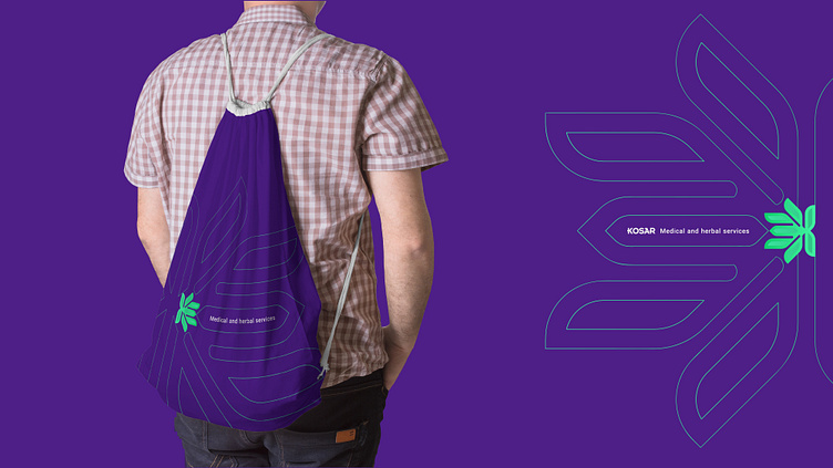
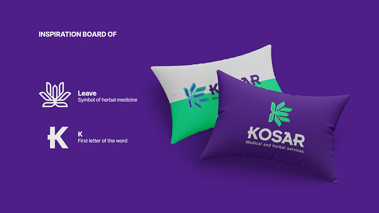
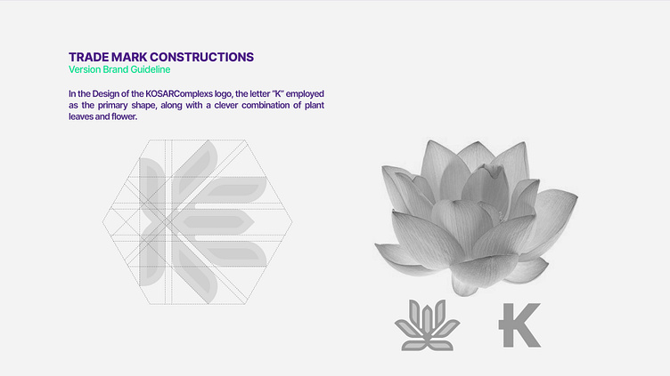
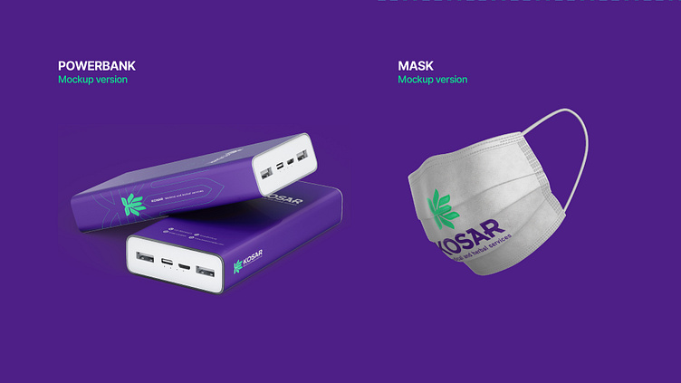
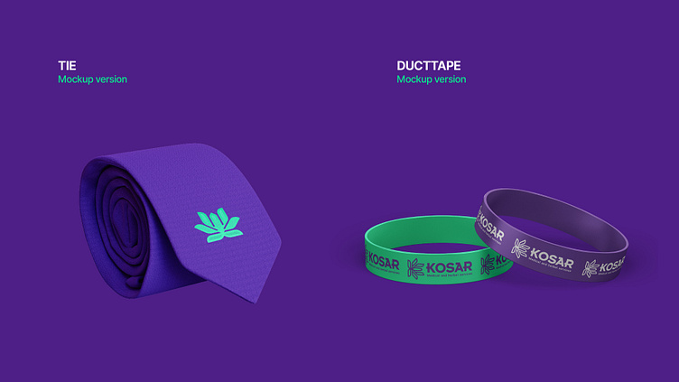
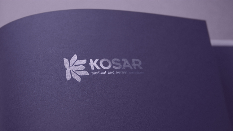
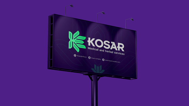
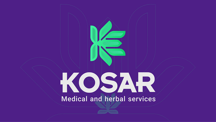
The company's logo uses two main symbols. The flower symbolizes beauty, delicacy, purity, and health, and the letter K is the first letter of the brand name. The flower, a beautiful and pleasant element, evokes positive emotions in the target audience and reminds them of nature and beauty, invoking positive feelings such as calmness, freshness, and energy. The combination of these two symbols is such that the petals are in the shape of the letter K. This combination creates an image of beauty, kindness, and health in the minds of the target audience, which is compatible with the company's field of activity. This shape also creates the capability of using logo in various fields such as business cards, packaging, and other health-related products.
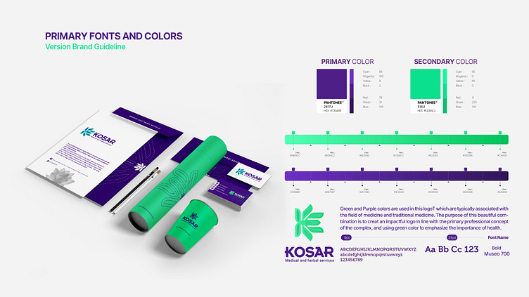
The chosen colors use color psychology principles. Green and purple are suitable for the medical and traditional medicine fields. Green symbolizes health, nature, and energy, bringing about a sense of calmness and reassurance. Purple also represents creativity, authenticity, value, and sovereignty.
Herbal medicine
• Logo Tasarım ve Görsel Kimlik
• Logo Design & Brand Identity