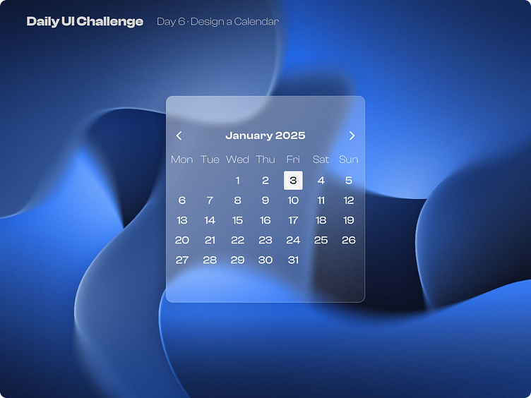
Day 6 of improving my UI skills · #6 Design a Calendar
Process
For today I had to design a calendar. Yesterday I sad I wanted to play with glassmorphism and I did it!. Well first I type all the content and make the auto-layout grids for the days. Chose a font and played with it's hierarchy. Then I started making the glass effect and add a drop shadow and the noise texture. Finally I chose the background image, which was the most difficult part I tried a lot of versions but finally I chose this 3D-noised-gradient-like image.
What I would change
Well today I struggled a lot choosing one image for the background, I had to ask my friends and after spending a lot of time changing images and tweaking the calendar's glass effect and colors.
This is a public challenge made by hype4 academy (or SquarePlanet I don't know).
Background Image from Unsplash.
