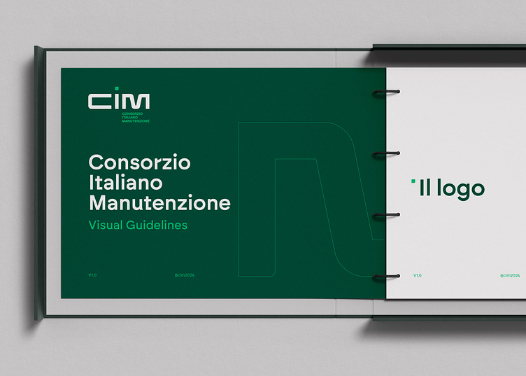
Consorzio CIM - Visual Guidelines
The Consorzio Italiano Manutenzione (CIM) is a stable consortium that brings together some of Italy’s largest engineering companies. The CIM consortium provides public administrations as well as private clients with architectural and civil engineering services aimed at the ordinary and extraordinary maintenance to preserving infrastructure assets over their life-cycle. The CIM consortium offers comprehensive support at every stage, from design to construction management. It offers specialized technical assistance, guaranteeing innovative and customized solutions, quality and precision.
Process
The design process for the Consorzio Italiano Manutenzione (CIM) logo was an exciting creative journey, driven by the intent to visually reflect the main sectors in which the consortium operates. The logo is composed of the three letters C, I, M, each carefully designed to represent a specific sector. The "C" symbolizes the railway system, with dynamic, curved lines that evoke tracks and the smooth movement of trains. The "I" represents the road system, featuring a vertical and robust design that recalls roads and highways, suggesting stability and connection. Finally, the "M" was created with strokes that resemble the structure of a bridge, with interconnected and solid forms that convey the idea of support and linking different points. Thus, each letter not only forms the name CIM but also visually embodies the essence of the consortium's work in their respective sectors, creating a strong and recognizable identity that communicates professionalism and reliability.
Read the full case study on: https://alessiogranella.com/project/consorzio-cim
