Minimalist typographic hotel logotype | Studio Suprasoul
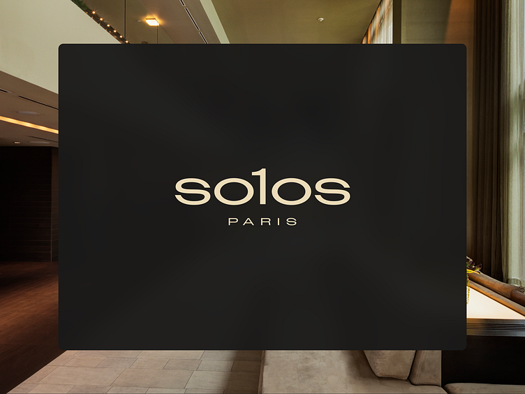
Are you struggling to find a brand identity that truly resonates with sophistication and elegance? The sleek, modern logo of Solos Paris features a clever typographic twist where the “L” is replaced with a “1,” subtly connecting to the meaning of “Solo” and the brand name. This minimalist design not only highlights the uniqueness of Solos properties but also symbolizes leadership and aspiration. Set against a dark, rich background, the logo exudes a sense of timeless elegance and exclusivity. We developed the brand positioning “Here, you are one of us,” which reflects a sense of belonging to a community and aligns perfectly with the brand name. This positioning emphasizes both the uniqueness of Solos properties and the inclusive community spirit, making each guest feel like part of an exclusive yet welcoming family. At Suprasoul, we specialize in creating premium branding solutions that reflect the essence of luxury and refinement. Our latest project with Solos Hotels Group captures the minimalist yet impactful design philosophy that defines our approach.
Let us help you transform your brand into a masterpiece of modern luxury. DM or contact us at hello@suprasoul.studio to discover how our bespoke branding services can set you apart in a competitive market.
