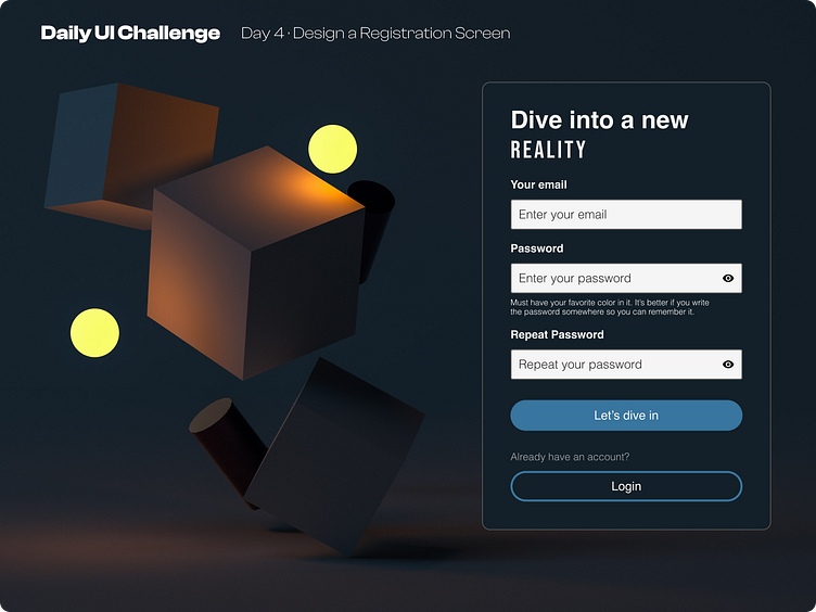
Day 4 of improving my UI Skills · #4 Design Registration Screen
Process
For day 4 I had to make a registration screen. Firs I wrote down all the copy that I needed, then I used the same input fields and buttons from yesterday. I wanted to play a little with the copy and typo so today I used a personalized copy for the button and the h1, for the "REALITY" I used bebas neue (love this typography). And finally I search for the image and found this dark-themed one, so I changed the UI to explore the Dark Theme.
What I would change
I would like to play with other layout and button styles like brutalism and glassmorphism.
This is a public challenge made by hype4 academy (or SquarePlanet I don't know).
Background Image from Unsplash.
More by Luis Diego Vindas View profile
Like
