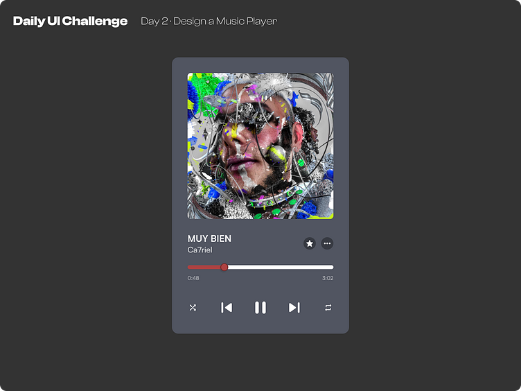
Day 2 of improving my UI Skills · #2 Design a Music Player
Process
For day 2 I've been asked to design a music player. So I started by choosing the song for the design (MUY BIEN by ca7riel), then gathering the cover asset and the icons from google material design.
What I would change
I find this design very usable, it is simple yet it works. I think for future days, I would like to play a little bit more with the background and other interface elements.
This is a public challenge made by hype4 academy (or SquarePlanet I don't know).
Image from ca7riel's "EL DISKO" (it's the cover image)
More by Luis Diego Vindas View profile
Like
