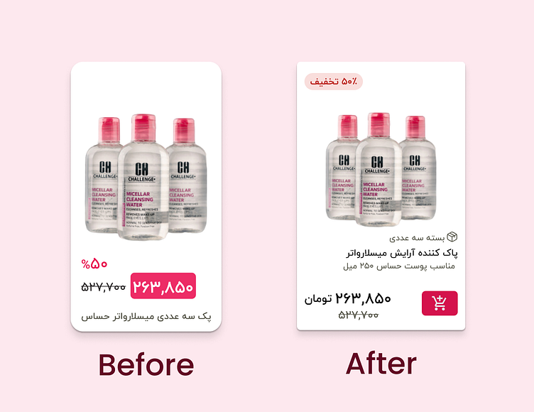
Redesigning the product card of Khanoumi shop
I redesigned the product card for Khanoumi's store according to user interface design principles.
The product details were incomplete and had poor contrast. Therefore, I divided the details into two categories: the main product name and additional specifications, creating a hierarchy for them.
The product price was styled like a button, which I changed to a regular text style. Considering the hierarchy, I placed it next to the original price before the discount.
I moved the discount sticker to the top of the card to reduce the clutter at the bottom and to distinguish between discounted and non-discounted product cards using the sticker.
More by Omid Heydari View profile
Like
