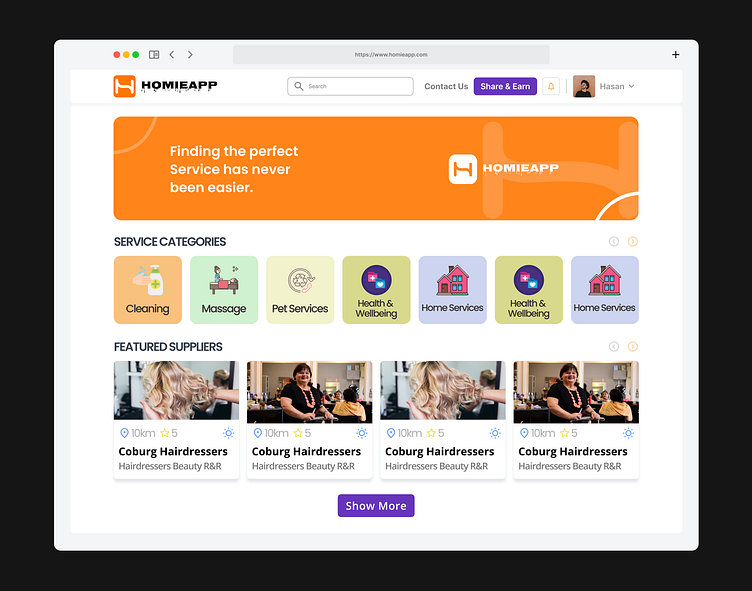
UI Design for TV
UI Design for TV
Designing the user interface for TV applications presents unique challenges and opportunities, requiring a focus on both aesthetics and usability to enhance the viewing experience. Here's a detailed look at what went into our UI design for TV:
Understanding the Context
TV interfaces are different from mobile or desktop interfaces due to the viewing distance and interaction methods. Our design process began with understanding these specific requirements. We conducted research on how users interact with their TVs, taking into account the use of remote controls, voice commands, and even gestures.
User Research and Persona Development
We engaged with users to gather insights on their preferences and pain points. This involved surveys, interviews, and usability testing with diverse demographics. Based on this data, we developed user personas that guided our design decisions, ensuring that our interface would be intuitive and user-friendly for a wide audience.
Wireframing and Layout Design
Using Figma, we created wireframes to map out the basic structure of the TV UI. The layout was designed to be clean and straightforward, with a focus on large, legible text and easily accessible navigation elements. We ensured that key features such as search, browsing, and content playback were prominently placed and easy to navigate.
Visual Design and Branding
The visual design phase involved creating a cohesive look and feel that aligned with the brand identity. We selected a color palette that was vibrant yet easy on the eyes, suitable for long viewing sessions. Typography was chosen for readability from a distance, with a clear hierarchy to distinguish between different types of content and menus.
Interactive Elements and Navigation
TV interfaces rely heavily on simple and intuitive navigation. We designed large, easily clickable buttons and incorporated visual cues to guide users through the interface. We also included smooth transitions and animations to enhance the overall experience, making interactions feel responsive and engaging.
Accessibility and Usability
Accessibility was a key consideration throughout the design process. We implemented features such as high contrast modes, adjustable text sizes, and support for screen readers. Usability testing with users of varying abilities helped us refine these features to ensure that the interface was accessible to everyone.
Prototyping and Testing
Figma’s prototyping tools allowed us to create interactive mockups of the TV UI. We conducted extensive testing with these prototypes, gathering feedback and making iterative improvements. This stage was crucial for identifying any usability issues and ensuring that the final design was both functional and enjoyable to use.
Final Design and Handoff
The final design was polished with attention to detail, ensuring consistency across all elements. We prepared comprehensive design documentation and assets for developers, facilitating a smooth transition from design to development. Figma’s collaboration features were invaluable during this phase, allowing us to maintain clear communication and alignment with the development team.
Conclusion
The UI Design for TV project resulted in an interface that is not only visually appealing but also highly functional and user-friendly. By focusing on the specific needs of TV users and leveraging Figma’s powerful design and prototyping tools, we created a seamless and engaging experience that enhances the way people interact with their TVs.
Contact with me - hasanuddinrimon23@gmail.com
Connect with me - https://www.linkedin.com/in/hasan-uddin-rimon-uiuxd/
Connect with me - https://www.facebook.com/h.u.rimon.ui.ux.designer/
You can visit here - https://onlineitghor.web.app/
