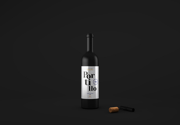
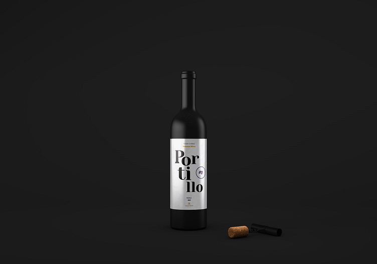
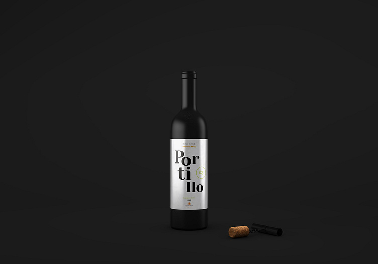
Wine Label Resdesign - Bodega Salentein
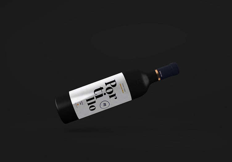
I decided to redesign the label of a popular wine in Argentina called Portillo, from Bodega Salentein. Located in Valle de Uco, Mendoza, where its wines yield the best results.
"The objective of Bodegas Salentein is clear: to produce wines of the highest quality, committed to the land where they originate. During their production, Salentein respects nature while simultaneously engaging with the local community; because people become an essential component reflected in the expression of the wines."
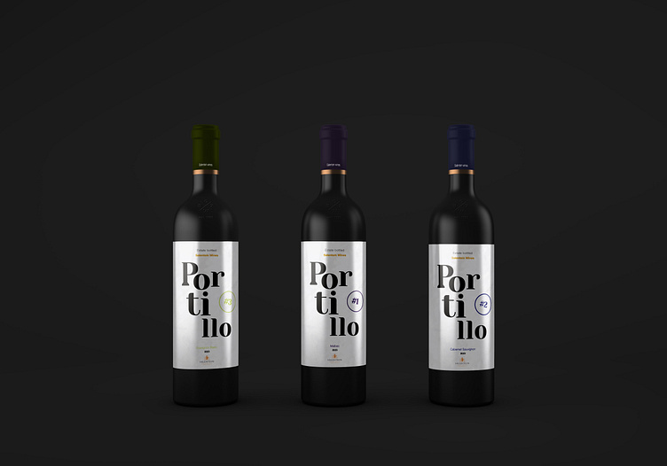
The line consists of 10 wines, one for each varietal, which the winery describes as a philosophy of "Premium wines" with a young and modern personality, where the flavors and aromas of fresh fruit predominate due to the high altitudes of the valley. They are innovative lines distinguished by their bright and intense colors and their pleasant way of drinking.
The fonts used were Yeseva One for the title of the line, with a slightly unstructured arrangement to convey the modernity of the wine, and Helvetica in its Light, Ultra Light, and Bold variants for the vintage, varietal, and wine descriptions.