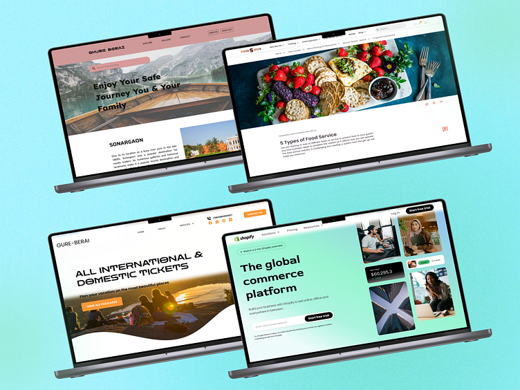
Web-page Hero section - UI Design
Web-page Hero section - UI Design
Designing the hero section of a web page is crucial for creating a captivating first impression and effectively communicating the brand's message. Here's what typically goes into designing a compelling hero section UI:
Visual Hierarchy: Establish a clear visual hierarchy to guide users' attention towards the most important elements, such as the headline or call-to-action (CTA). Use size, color, contrast, and placement to emphasize key content.
Engaging Imagery: Select high-quality and relevant images or illustrations that resonate with the brand identity and target audience. Visuals should evoke emotion and support the overall message of the page.
Concise Messaging: Craft concise and compelling copy for the headline and subheadline that communicates the value proposition or key message succinctly. Use clear and persuasive language to entice users to explore further.
CTA Design: Design the CTA button to stand out and encourage user interaction. Use contrasting colors, ample white space, and concise text to make the CTA visually prominent and easy to click.
Responsive Design: Ensure that the hero section adapts seamlessly to different screen sizes and devices. Design with mobile-first principles in mind to prioritize the user experience on smaller screens.
Scroll Indicators: If the hero section includes additional content below the fold, consider incorporating subtle scroll indicators or arrows to encourage users to explore further.
Brand Consistency: Maintain consistency with the brand's visual identity, including colors, typography, and imagery, to reinforce brand recognition and credibility.
Loading Performance: Optimize image sizes and minimize unnecessary elements to ensure fast loading times, especially for users on slower internet connections or mobile devices.
Accessibility: Ensure that the hero section is accessible to users with disabilities by following accessibility guidelines for contrast ratios, font sizes, and keyboard navigation.
A/B Testing: Conduct A/B testing to experiment with different variations of the hero section, including imagery, copy, and CTAs, to optimize for conversion and user engagement.
Analytics Integration: Integrate analytics tracking to measure the performance of the hero section, including click-through rates, bounce rates, and conversion metrics, and use data to inform iterative improvements.
By considering these aspects in the design process, the hero section of a web page can effectively capture users' attention, communicate key messages, and drive desired actions, ultimately contributing to the overall success of the website.
Contact with me - hasanuddinrimon23@gmail.com
Connect with me - https://www.linkedin.com/in/hasan-uddin-rimon-uiuxd/
Connect with me - https://www.facebook.com/h.u.rimon.ui.ux.designer/
You can visit here - https://onlineitghor.web.app/
