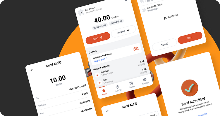
Concept of a secure crypto wallet
Context
As a UX/UI Designer, I propose the concept of a secure crypto wallet "Puzzle Wallet" using zk technology for the Aleo blockchain, integrated as an extension for Google Chrome.
Problem
The existing interface lacked modernity and cohesion, potentially hindering user interaction and adoption. Key challenges included outdated visuals, inconsistent design elements, and a lack of visual hierarchy, resulting in a cluttered and unintuitive user experience.
Solution
The existing interface lacked modernity and cohesion, potentially hindering user interaction and adoption. Key challenges included outdated visuals, inconsistent design elements, and a lack of visual hierarchy, resulting in a cluttered and unintuitive user experience.
Updating colors
The first step was to update the color scheme to reflect a more contemporary aesthetic while retaining the essence of Puzzle Wallet's brand identity. By introducing subtle variations and complementary colors, the design achieved a harmonious balance between familiarity and innovation. The primary color was maintained for brand recognition, while additional hues were strategically incorporated to enhance visual interest and usability.
Improving fonts and structure
Font sizes were carefully adjusted to improve readability and create a more cohesive visual hierarchy. Clear heading styles were implemented to guide users through the interface seamlessly. By standardizing typography across different sections of the platform, consistency was achieved, enhancing overall usability and navigation.
Strengthening brand identity
To reinforce Puzzle Wallet's brand identity, a distinctive puzzle figure was integrated into the design elements. This subtle yet recognizable motif served as a visual anchor, strengthening brand recall and adding a touch of personality to the interface. Through strategic placement and use of the puzzle symbol, Puzzle Wallet's unique identity was brought to the forefront, fostering a deeper connection with users.


