MoodSync - Brand design for an emotional well-being app
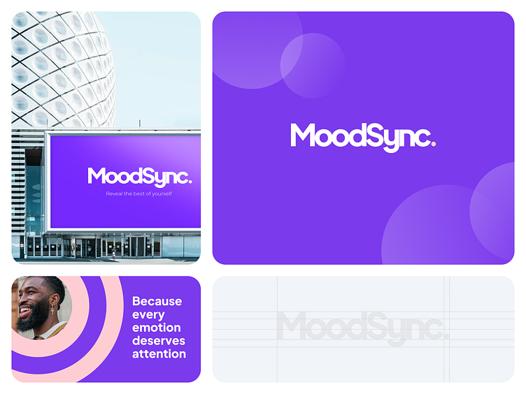
MoodSync - Reveal the best of yourself.
Enter your text here...MoodSync is a fictional application dedicated to emotional well-being with a modern and calming visual identity.
First impressions that last
At MoodSync, we believe that every interaction with our app should be memorable and positive. This is why we designed a visual identity that is captivating and soothing from the first glance.
Color Palette: Our shades of purple and pale pink create a serene ambiance, promoting calm and tranquility. These calming colors help users feel immediately comfortable and confident.
Typography: We have chosen modern and readable fonts to provide a smooth and pleasant user experience. Each word is carefully presented to encourage clarity and understanding.
At MoodSync, every detail is thought of so that your first impression is not only positive, but also lasting. We want every user to feel warmth, support and innovation from the first moment.