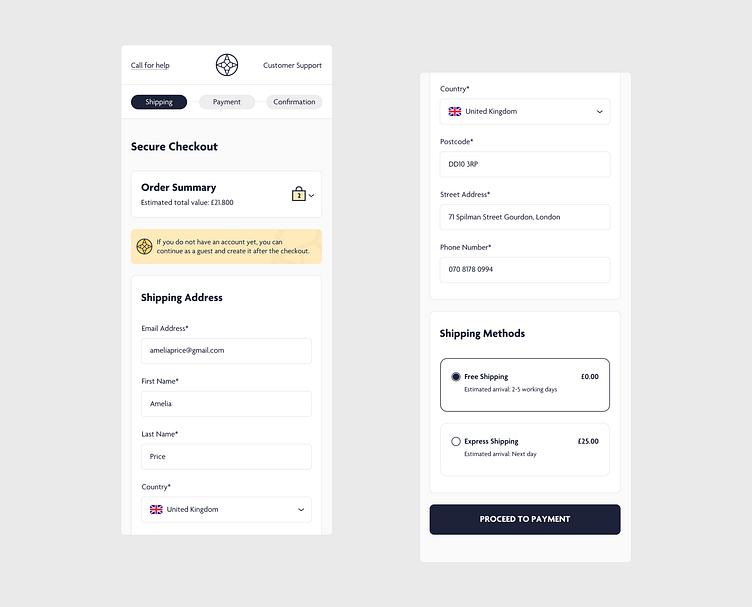
Checkout Process - Shipping
Designing a mobile checkout process poses unique challenges, particularly in ensuring clarity and ease of use on smaller screens. Here's my take on creating a seamless and user-friendly mobile checkout experience.
Challenges and Solutions: One of the main challenges is ensuring that all essential information is accessible and easy to input without overwhelming the user. I've focused on clear layouts, intuitive navigation, and minimizing the number of steps required to complete a purchase.
Key Elements: Key elements include easy-to-tap buttons, clear progress indicators, and error handling to guide users smoothly through the checkout process. Consistency and simplicity are crucial to avoid user frustration.
User Experience: Prioritizing user experience, I've designed forms that are easy to fill out with features like autofill, mobile-friendly keyboards, and real-time validation to reduce errors and speed up the process.
Visual Design: The visual design aims to be clean and distraction-free, with a focus on readability and touch-friendly elements. Colors and typography are chosen to enhance usability and create a pleasant visual experience.
I hope this design can serve as a helpful reference for anyone tackling the complexities of a mobile checkout process. Designing for clarity, simplicity, and user trust has been a rewarding challenge, and I’m excited to share my approach. Your feedback is always welcome and appreciated!
