BBInvest | LOGO DESIGN & BRAND IDENTITY

BBInvest is committed to providing customers with high quality IT products and services, applying the most modern technologies to support them in their work and daily life. The spirit of innovation and connection are the top values that BBInvest wants to bring to customers.
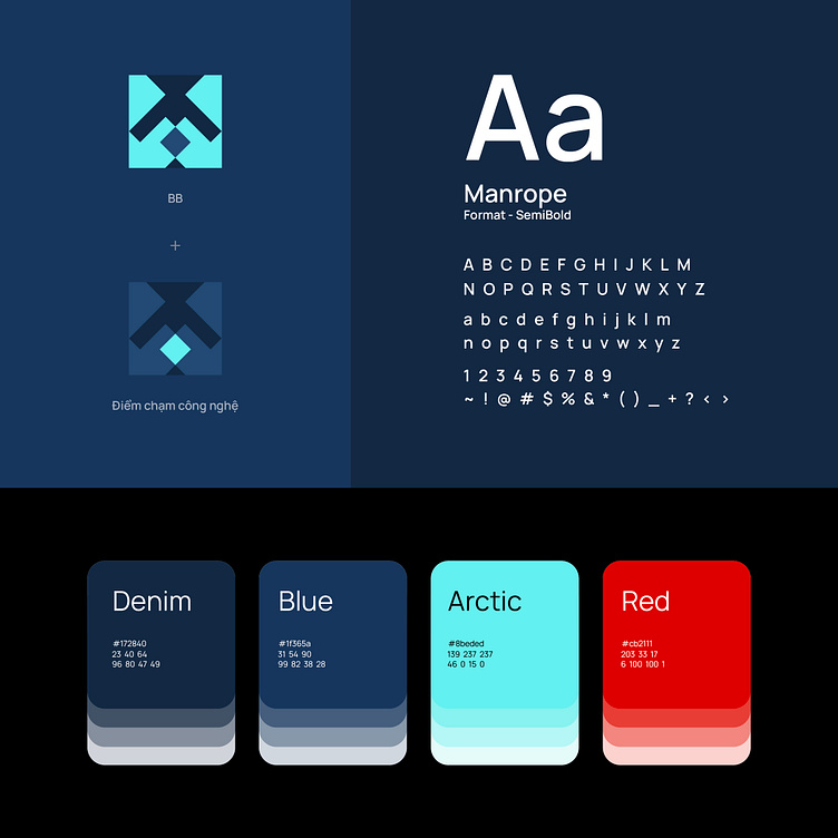
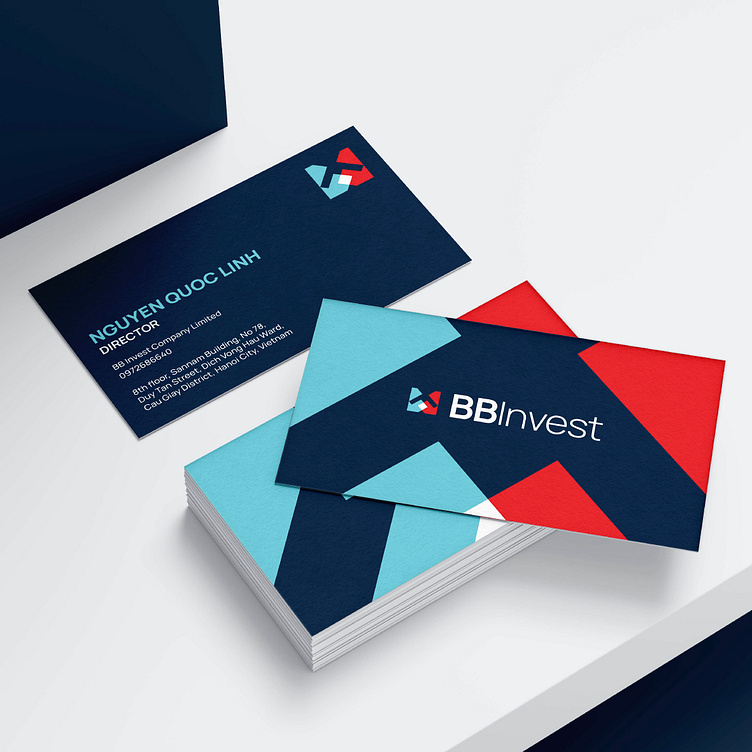
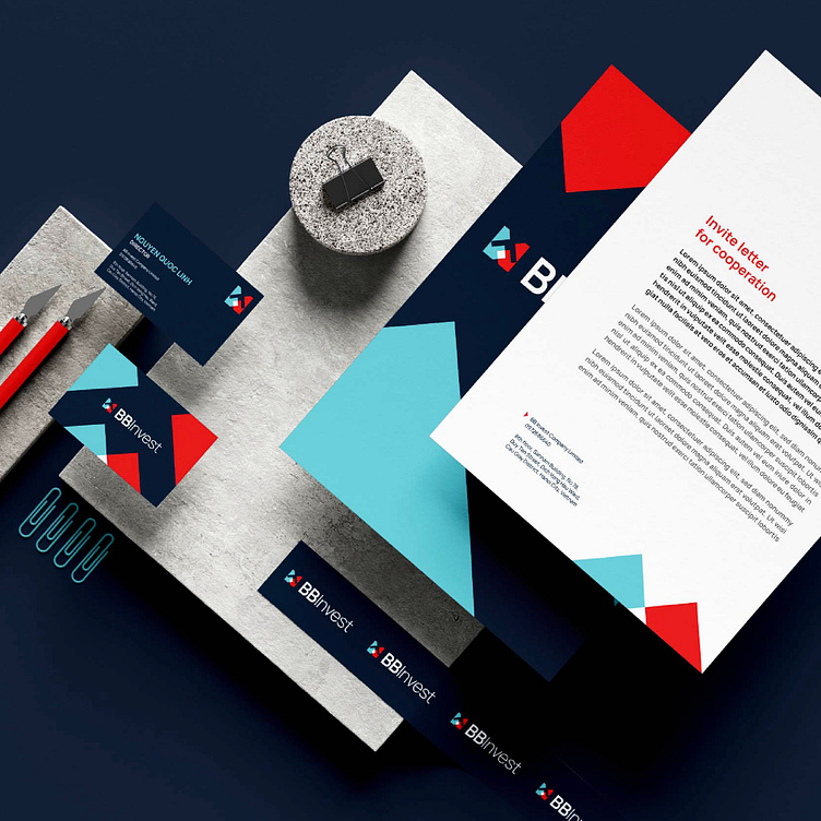
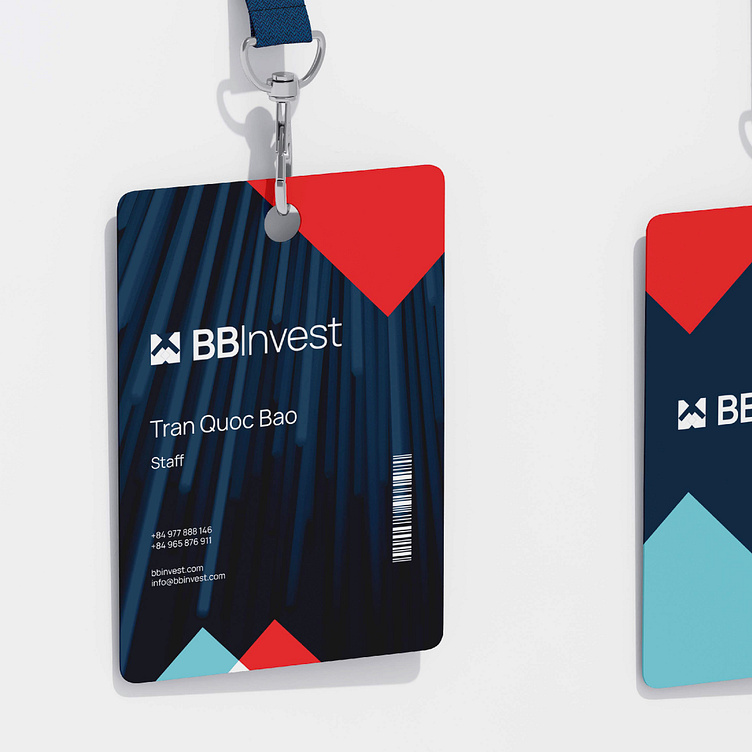
Based on those values, Bee Art designed the brand identity for BBInvest with two main colors, arctic blue and red, creating high contrast and attracting attention. Different from the blue-black color that creates a sense of reliability, the arctic blue color represents technology connectivity and integration, demonstrating that the brand is always ready to integrate cutting-edge technologies to create comprehensive solutions that meet all customer needs. Red symbolizes enthusiasm, energy and innovative spirit. This is the color of passion and determination, reflecting BBInvest's commitment to constantly innovating and evolving.
BBInvest's logo is designed with the basic shape of a square, symbolizing stability and solidity. The square represents stability and consistency, is a symbol of stability and reliability. Inside the square are two "B" letters interlocked, creating a unique and deeply meaningful image. The intersection of the two letters "B" denotes the technological touchpoint. This is a symbol of connectivity and technology intersection, emphasizing BBInvest's ability to connect and integrate in providing advanced technology solutions to customers.
Overall, BBInvest's brand identity is the perfect combination of geometric elements, colors and symbols, creating an image that is easily recognizable and imbued with brand values.
Designed by Bee Art
-
Client BBInvest
Logo and Branding Project. Logo is design for Informatics Trade Company in Vietnam.
Copyright© Bee Art. All Right Reserved
Contact us:
• Hotline/ Zalo: (+84) 77 34567 18
• Email: info@beeart.vn
• Website: www.beeart.vn
• Facebook: https://www.facebook.com/BeeArt.vn