Daily Typography: Day 04 Inter
Which is the best open-source font (and also available on Google Fonts)?
Well, of course it's Inter, by Rasmus Andersson.
A versatile and highly legible typeface.
Originally created for computer screens, Inter's design focuses on readability and clarity at both small and large sizes. It features tall x-heights, open apertures, and a subtle balance between organic curves and geometric precision.
It is available in multiple weights, making it suitable for a wide range of applications from body text to headlines.
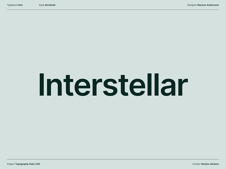
Choosing the word "Interstellar" was a natural fit, inspired by the typeface's name and the balanced look of its letters. The word itself contains a diverse array of characters that showcase the typeface's versatility.
Plus, "Interstellar" holds a special place in my heart as the only movie I've ever seen twice in the cinema, making this combination even more meaningful.