Commencement Packaging
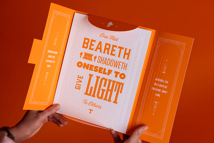
For the past few graduations we gave students some cool debossed graduation prints that they could frame with they got home. This year, we finally put it in packaging that actually looked and felt similar to the print itself.
Biggest thing on this one was making sure we got the Power T large on the front. The whole time while designing this one, I was envisioning how photography would look day of. I wanted to make sure when we got images back from our photographers you'd see our logo being prominent from any distance.
I also wanted to create a debossed effect on the front so it made the whole package feel like it was meant to go together. We used 130# Cougar Cover as our paper so it could feel like something you'd keep.
Overall it was a fun piece to work on.


