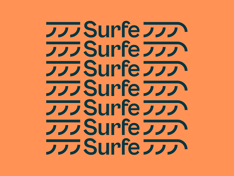
Surfe Case Study
More than a tool, Surfe is the modern company for the next wave of revenue teams. 🌊
Surfe had to evolve from simply a tool to a brand garnering serious consideration by high-growth and first-generation tech companies, all while balancing a sense of premium and playfulness.
Surfe needed to retain credibility with high-growth and first-gen tech companies, but anything corporate just didn't fit the brand. So we explored various ways to convey Surfe’s playfulness and joy while not leaning kitsch. Colors are exuberant, and photography has an undertone of summer vibes. Imagery and graphic components are inspired by the tail shape of various surfboards.
Illustrations by Maria Mileńko embody the theme of “moving freely.” The style amplifies humanity and personality. Illustrations are used to strategically meet people where they are — a newsletter, hero section, callout, or social media post.
Lettera Text is Surfe's exclusive and primary brand font. It carries the playful, upbeat, motivating, and laid-back communication style and doesn't compete with all the other bold visual elements at play.
Looking for a brand agency? We would love to hear from you.
Email us: hello@focuslab.agency


