Ferizy - Mobile Apps (Redesign)
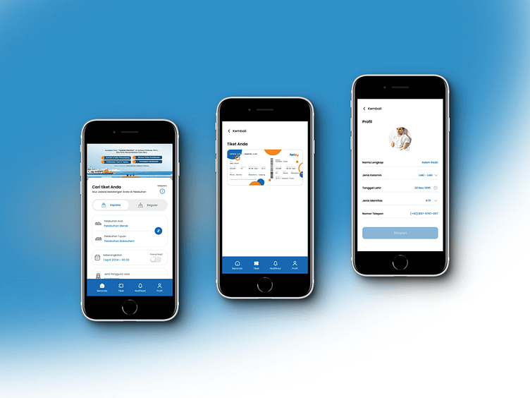
What's in the redesign?
Home Page
View Tickets Page
Profil Page
Why redesigned?
The home page is made contemporary/modern.
Button fields on the home page are made a little large and add a little whitespace so that users with large hands can click safely without having to squeeze other button fields, causing the wrong booking.
Adding an on / off switch to the departure ticket booking, because it is intended that the user does not need to order a ticket again when he wants to return to the destination area.
On the ticket page, I made a ticket image that can be downloaded in various types of formats such as pdf, jpg or png for offline, this aims to minimize the user when he is opening the application, to be shown to the ship ticket officer, but there is no signal / interference / sudden maintenance from the developer.
On the profile page, I added a profile photo, this is so that users who are lost or drowned can be tracked.
You can see it in the "Ferizy" application on Playstore or Appstore
Creating using Figma.
Instagram | UI8 | Figma Community | Email
