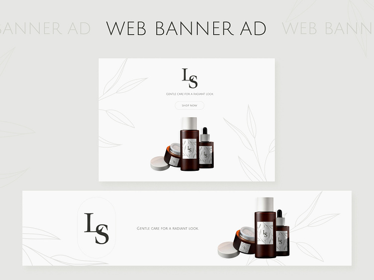
BANNER AD | MINIMALISM | CLEAN DESIGN
The first banner delivered information about the salon, highlighting its services and special offers. The second banner featured a call-to-action button that led customers directly to the product page. The implementation of a clean design and this action button led to an increase in facial care cosmetics sales. The minimalist design drew attention to the products, streamlining the decision-making process for clients.
More by AnastasiaMiroshnikova View profile
Like


