FAQ Section UI Design
Hello everyone! 👋
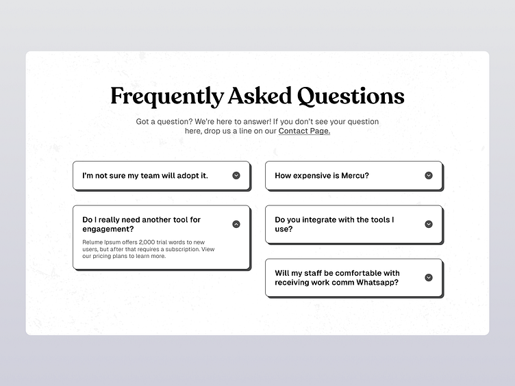
This design is a "Frequently Asked Questions" (FAQ) section for a website. The layout features a clean and modern aesthetic, with a header that reads "Frequently Asked Questions" in bold, black font. Below the header, there is a brief introductory text inviting users to contact the company if their question is not listed.
The FAQ section includes six questions, each in a rectangular, collapsible box with rounded corners. These boxes have a shadow effect to give a slight 3D appearance. The questions are:
"I’m not sure my team will adopt it."
"How expensive is Mercu?"
"Do I really need another tool for engagement?"
"Do you integrate with the tools I use?"
"Will my staff be comfortable with receiving work comm WhatsApp?"
Each question has a drop-down arrow icon indicating that more information can be revealed by clicking on it. The answers to the questions are revealed upon interaction, as exemplified by the expanded answer for "Do I really need another tool for engagement?" which explains about the trial offer and subscription details.
At the top of the section, there is a call-to-action link labeled "Contact Page," providing users a direct way to reach out for further inquiries. The overall design is user-friendly, with a focus on simplicity and accessibility.
⬇️
Let us know your opinion and stay with me Happy Designing 😊🚀
Share the love if you like this shot ❤️
for Project Inquiry email: hellohridoy01@gmail.com
Feedback is always appreciated.
Thank you!
