Coffee Hatch Branding
Coffee Hatch
I set out to create a visually appealing and engaging brand identity for "Coffee Hatch," a coffee company, and to design a website that effectively captures the brand’s playful nature while driving user engagement and sales.
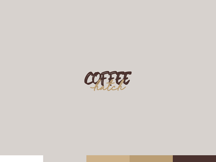
The logo uses a bold, handwritten-style font for "COFFEE" and a more elegant, cursive style for "hatch." This combination conveys both the artisanal quality of the coffee and a relaxed, approachable vibe. This dual font approach helps to balance the professional aspect of the brand with a casual, friendly tone, appealing to a wide audience.
The use of dark brown and a lighter beige/brown color reflects the natural colors of coffee beans and coffee grounds, creating a strong association with the product. The earthy tones are inviting and comforting, evoking the warm experience of enjoying a cup of coffee.
✌️Do you have a project in mind? Let's chat at https://www.lazybranding.com/
The website continues the earthy color palette of browns and beiges from the logo, ensuring brand consistency. This cohesive color scheme enhances brand recognition and provides a visually pleasing experience that is easy on the eyes.
The header features a repeating message about double points, adding an incentive for customers. The navigation is straightforward, focusing on key actions such as finding coffee and shopping. This approach simplifies the user journey, making it easy for visitors to understand the benefits and navigate the site efficiently.
The hero section features a dynamic background with large, high-quality images of coffee beans, creating an immediate connection to the product. This visual strategy draws users in, making the site feel lively and engaging.
The playful tagline "Where the heck have you bean?" uses a pun to create a memorable and fun first impression. This clever use of language makes the brand approachable and memorable, encouraging visitors to explore further.
Featuring the "New Arrivals" section directly below the hero section highlights the latest products, keeping the content fresh and engaging. This placement encourages users to explore new products, potentially increasing sales of these items. The product images are simple and uniform, focusing on the packaging which would in a final setting contain detailed product information. Brief descriptions or names are not prominently featured, suggesting an emphasis on visual appeal and brand identity over detailed product descriptions in this section. This minimalist approach keeps the focus on the visual appeal of the packaging, which can be particularly effective if the packaging is a strong aspect of the brand identity.
Too lazy to read all that...
The "Coffee Hatch" branding and website design effectively combine a playful, memorable tagline with visually engaging elements and a cohesive color scheme. By using a blend of handwritten and cursive fonts, earthy colors, and dynamic visuals, the design communicates the artisanal quality of the coffee while maintaining an approachable and friendly tone. Strategic placement of CTAs and a focus on new arrivals ensure a seamless user experience, driving engagement and encouraging sales. This design approach successfully meets the objectives of creating an appealing brand identity and a user-friendly website that promotes customer interaction and growth.

