Cheese Bored Branding

Cheese Bored
I set out to create a fun, approachable, and visually appealing brand identity for "Cheese Bored," a charcuterie board company, and to design a website that effectively communicates the brand’s playful yet gourmet nature while encouraging user engagement and sales.
The use of a casual, handwritten-style font for "Cheese bored." was deliberate to convey a sense of fun and approachability. This font choice makes the brand feel friendly and accessible, aligning with the playful theme. It helps to distinguish the brand in a market often filled with more formal, upscale competitors, appealing to a younger or more laid-back audience.
Incorporating a simple cheese wedge icon next to the text not only reinforces the product focus but also adds a whimsical element to the logo. The icon’s design, with its characteristic holes, makes it immediately recognizable. The visual pun (cheese wedge) creates a memorable brand mark that can be easily associated with the company's offerings.
✌️Do you have a project in mind? Let's chat at https://www.lazybranding.com/
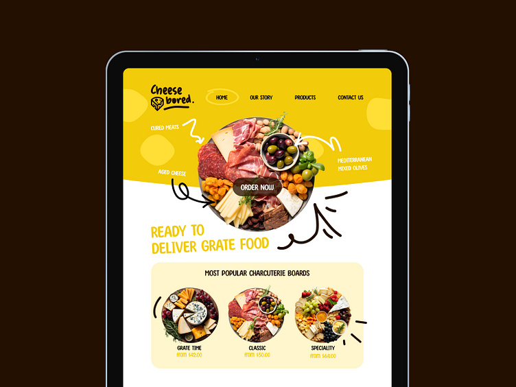
The website uses the same bright yellow, white, and dark brown color scheme as the logo to maintain brand consistency. This creates a unified visual identity across all touchpoints. Consistent use of colors enhances brand recognition and provides a pleasant, cohesive user experience.
Featuring a large, high-quality image of a charcuterie board immediately showcases the product, appealing to the user’s appetite and visual senses. This prominent image serves as an instant draw for visitors, encouraging them to explore more.
The "Order Now" button is strategically placed on the image to prompt immediate action from visitors. A well-placed CTA increases conversion rates by making it easy for users to make a purchase decision without additional clicks.
The playful tagline "Ready to deliver grate food" incorporates a pun on "grate/great," aligning with the brand’s fun personality. This clever use of language helps the brand stand out and be memorable, enhancing its identity.
Too lazy to read all that...
The "Cheese Bored" branding and website design successfully blend fun and gourmet elements to create a memorable and engaging user experience. By using a playful font, recognizable iconography, a cohesive color scheme, strategic visual elements, and clear CTAs, the design effectively communicates the brand’s identity and drives user engagement. This approach ensures that visitors not only remember the brand but are also encouraged to make purchases, thereby supporting the company’s business goals.
