Product page structure for a Cosmetic Brand
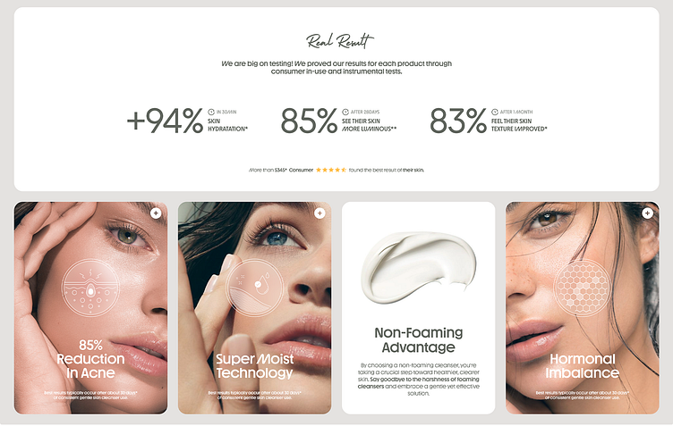
This is a sneak peek at the core structure we designed for a brand's cosmetic product page.
In this initial phase, aBox Agency prioritized creating a user-friendly layout that effectively communicates the cleanser's value proposition. Key statistics and percentages are prominently displayed to showcase the product's efficacy.
We've incorporated benefit-oriented language to highlight how the cleanser addresses common skin concerns.
A clear call to action button allows users to easily add the product to their cart.
More of this work coming soon, with interactive elements & UX!
Let's craft a product page that converts for your brand.
hi@abox.agency 📩
More by aBox Agency View profile
Like
